Upload date
All time
Last hour
Today
This week
This month
This year
Type
All
Video
Channel
Playlist
Movie
Duration
Short (< 4 minutes)
Medium (4-20 minutes)
Long (> 20 minutes)
Sort by
Relevance
Rating
View count
Features
HD
Subtitles/CC
Creative Commons
3D
Live
4K
360°
VR180
HDR
78,417 results
In this tutorial, you'll learn about how to Data Visualization by using Plotly. Plotly is the best tool in Python for Data Visualization.
157 views
3 years ago
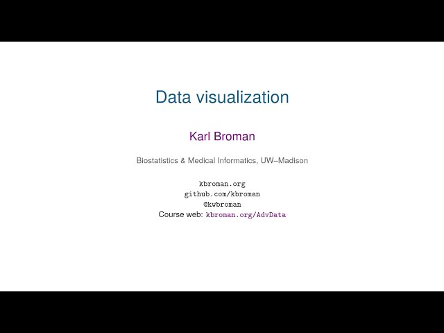
2020-03-31 lecture from Advanced Data Analysis course at UW-Madison, https://kbroman.org/AdvData, on data visualization.
154 views
5 years ago
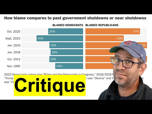
Pat introduces the DAIJ model for giving a critique to a data visualization that is often used to critique art. By describing, analyzing ...
671 views
4 months ago
Try CodeCrafters for free using my referral link: https://app.codecrafters.io/join?via=trentpark8800 In this walkthrough, we dive into ...
90,271 views
1 year ago
Presented by Angela Zoss. This video is part of a series of lectures recorded to teach about basic data visualization concepts.
59 views
4 years ago
Join the Skool AI Community – blueprints, tutorials, tools & expert help to level up fast! https://bit.ly/454oVuE Links ...
11,402 views
9 months ago
Whenever we see or generate a data visualization it's important that we review what does and doesn't work in the visual. In this ...
1,861 views
Errata: at 46:20 -- you type the name of the file -- should say: -- you type the command "barplot" first. -- NOTE: audio is left channel ...
1,350 views
6 years ago
"Using Jupyter Notebooks for data-driven visualisation workflows" by Jan-Hendrik Müller Blender Conference 2024 2024-10-25 ...
6,807 views
Learn how to craft effective data visualizations. Part of https://curran.github.io/dataviz-course-2018/
7,785 views
7 years ago
An introduction to Data Visualization. An insight into Data Visualization Concepts, Display Media, Dashboards and Design ...
109 views
Presented: April 12, 2018 Transcript: ...
4,713 views
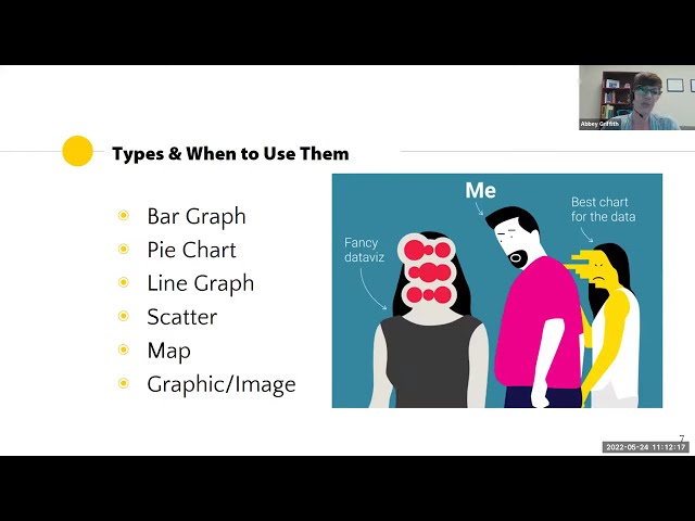
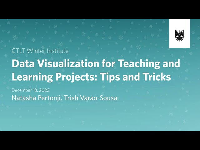
Dissemination is a critical part of teaching and learning projects. Choosing the best visualizations for sharing quantitative and ...
461 views
Check out all my Full Courses on Analyst Builder: https://www.analystbuilder.com/ 25% Off Analyst Builder Code: BOOTCAMP In ...
1,040,630 views
Data Visualization with Python. Learn Matplotlib, Numpy, line plot, bar plot, scatter plot, histogram, data set, and distribution ...
38 views
2 years ago
Take my Full Pandas Course Here: https://www.analystbuilder.com/courses/pandas-for-data-analysis Download Datasets: ...
121,759 views
Data matters, but so does how you present it. We use data every day and the way we visualize and share it can have an impact on ...
82 views
In this video, I am trying trying to plot some line charts using a package call go-chart, ...
4,675 views
Subscribe to show your support: https://bit.ly/2GwtvXN --~-- More and more designers are finding their foothold in data ...
196 views
Featuring Laura Quinn and Sart Rowe In this webinar we look at some best practices and common pitfalls to making data ...
563 views
8 years ago


![Ultimate Data Analyst Bootcamp [24 Hours!] for FREE | SQL, Excel, Tableau, Power BI, Python, Azure](/api/proxy/image?url=https%3A%2F%2Fi.ytimg.com%2Fvi%2FwQQR60KtnFY%2Fsddefault.jpg)