Upload date
All time
Last hour
Today
This week
This month
This year
Type
All
Video
Channel
Playlist
Movie
Duration
Short (< 4 minutes)
Medium (4-20 minutes)
Long (> 20 minutes)
Sort by
Relevance
Rating
View count
Features
HD
Subtitles/CC
Creative Commons
3D
Live
4K
360°
VR180
HDR
133,930 results
Sign up for a free Jotform account at: https://link.jotform.com/MtNwY2uuo1 Do you want to know the best ways to implement data ...
2,304 views
4 years ago
Dale shows us 12 tips to design better dashboards. Whichever dashboard tool you are using, the lessons we cover in this video ...
267,521 views
3 years ago
In this video, I break down some of the 'science' behind effective data visualization and how you can build better dashboards by ...
383,788 views
2 years ago
MENTORSHIP – Applications for the March 2026 cohort are now open! Apply here → https://theanalyticsaccelerator.com/ We're ...
50,345 views
11 months ago
You've probably heard the term data visualization thrown around a lot. It's why you're here, isn't it? So let's make it clear — data ...
181,262 views
A lot of people know how to build charts, but how can you bring that to the NEXT LEVEL? SO WHAT In this video I'll show you ...
2,969 views
Let's look at how we can implement design concepts and techniques to maximize the impact of our dashboards and reports.
86,693 views
From the "637: How to Influence Others with Your Data" in which @AnnKEmery, data visualization designer and owner of Depict ...
579 views
Apparently you lose all credibility by using Pie Charts , so in this video, I share 7 Data Storytelling Tips to Improve Your ...
221,761 views
Setup, conflict, resolution. You know right away when you see an effective chart or graphic. It hits you with an immediate sense of ...
636,989 views
6 years ago
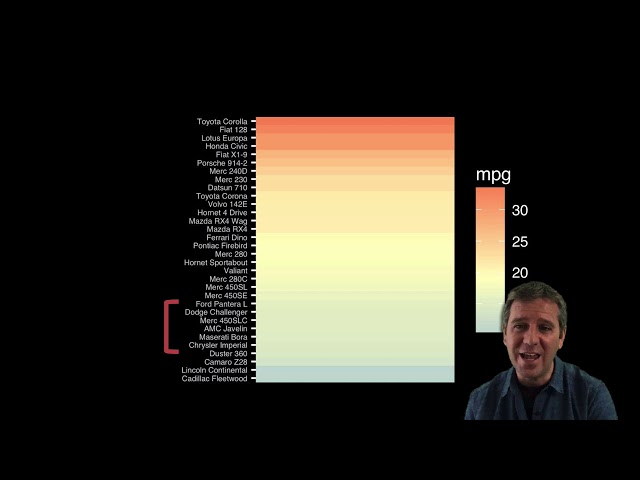
Following a look at 'Sensemaking' Associate Professor Dr Kai Xu delves into some more tricks of the visualisation trade.
75,386 views
We're all bombarded with information and content, and it's often overwhelming. So how do you quickly separate the important ...
753 views
5 years ago
Let's look at the art of visualizing data. How do you make eye catching visuals while keeping them easy to consume and ...
13,521 views
Book a FREE 15-min Tableau call here: https://forms.gle/DfW6TJkMjsmBytig8 Connect with us: •Upcoming Tableau Classes: ...
4,367 views
ai #ml #datascience #datavisualization #presentation #artificialintelligence #machinelearning #education #visualization Data ...
6,413 views
1 year ago
In this video, you'll learn how to visualize data totals, trends, geographical data, and more with Excel's TOP 5 data visualization ...
7,082 views
In this dashboard design tutorial, you'll learn to build better business dashboards. Effective data visualisation is an integral part of ...
106,819 views
Build an interactive Excel dashboard for better data visualization in less than 20 minutes. ❗Master Excel with my courses: ...
77,084 views
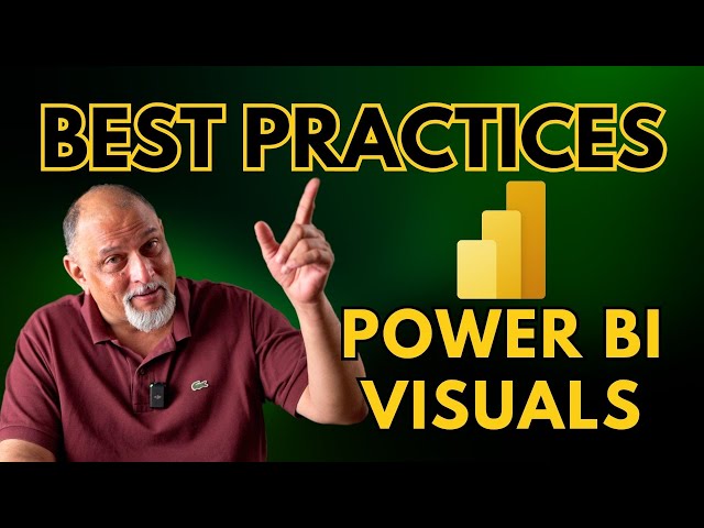
Power BI has a large collection of visuals. Using the right visual is important. In this video we will learn nine best practices about ...
2,767 views
In this video, Chris Dutton introduces data visualization principles and best practices, and demonstrates how to apply them to ...
45,077 views
Viewers like you help make PBS (Thank you ) . Support your local PBS Member Station here: http://to.pbs.org/Donateoffbook ...
510,271 views
12 years ago
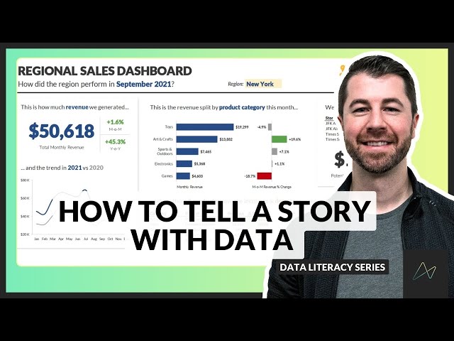
In this video, Chris Dutton explains the framework for telling clear and effective stories with data, an important topic for anyone ...
364,164 views
Patrick looks at a few data modeling best practices in Power BI and Analysis Services. These are things we see customers doing ...
475,910 views
Take our Report Development Best Practices Checklist course: ...
32,631 views
Made for BIMM143. For more information see: http://thegrantlab.org/bimm143.
634 views