Upload date
All time
Last hour
Today
This week
This month
This year
Type
All
Video
Channel
Playlist
Movie
Duration
Short (< 4 minutes)
Medium (4-20 minutes)
Long (> 20 minutes)
Sort by
Relevance
Rating
View count
Features
HD
Subtitles/CC
Creative Commons
3D
Live
4K
360°
VR180
HDR
5,548,144 results
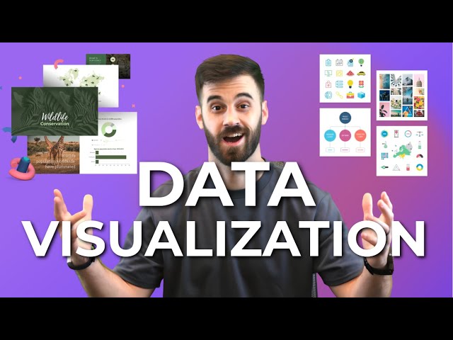
You've probably heard the term data visualization thrown around a lot. It's why you're here, isn't it? So let's make it clear — data ...
181,621 views
3 years ago
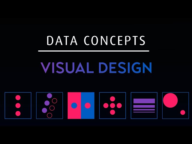
Let's look at how we can implement design concepts and techniques to maximize the impact of our dashboards and reports.
86,825 views
4 years ago
MENTORSHIP – Applications for the March 2026 cohort are now open! Apply here → https://theanalyticsaccelerator.com/ We're ...
50,766 views
11 months ago
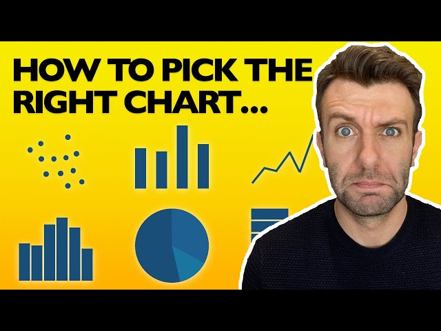
In this Chart, Graph and Data Visualization tutorial for beginners, find out everything you need to know to choose the right type of ...
230,016 views
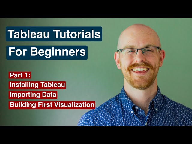
Want to learn Power BI fast? Start with this beginner-friendly tutorial where you'll import data, clean it, build your first interactive ...
1,190,148 views
9 months ago
In this video, we will demonstrate the difference between data visualization charts including: - Bar Chart - Line Chart - Bubble ...
189,108 views
6 years ago
Nano Banana + Gemini 3: The Data Visualization Workflow You Need | Stop Making Boring Charts – Use This Nano Banana + ...
25,022 views
3 months ago
Check out my Full Tableau Course Here: https://www.analystbuilder.com/courses/tableau-for-data-visualization This is our first of ...
985,074 views
In this video lecture series, we introduce Power BI (Business Intelligence), show users how to create data dashboards with visuals ...
7,172 views
2 years ago
Try RESPLENDENT DATA for FREE and unlock the full potential of your data: https://resplendentdata.com/mochen Portfolio, ...
6,261 views
Welcome to this video on RawGraphs.io, an open-source data visualization tool designed for everyone—from beginners to data ...
1,889 views
In this video, I break down some of the 'science' behind effective data visualization and how you can build better dashboards by ...
384,081 views
In this video I talk about using R to visualise your data. Data visualization using R is best done using the ggplot (ggplot2) package.
163,049 views
Tableau Fundamentals by DataCamp: https://datacamp.pxf.io/K0O9g9 Data Analyst in Tableau by DataCamp: ...
56,568 views
10 months ago
In this video, I present a very powerful data viz library with hundreds of charts that you can use in our projects for free: Apache ...
36,453 views
5 years ago
Plotly Tutorial 2021 in Streamlit | Learn Plotly Introduction to Plotly Data Visualization | Python In this tutorial, I have demonstrated ...
2,264 views
Build an interactive Excel dashboard for better data visualization in less than 20 minutes. ❗Master Excel with my courses: ...
77,221 views
1 year ago
In this video Rob, a Kaggle Grandmaster, quickly and humorously walks through each of the popular plotting and data ...
110,309 views
Descriptive statistics is all about describing you data. To do this we firstly describe the spread of the data using the range and ...
124,749 views
Learn Data Analysis Essentials in Excel in Just 12 minutes! Take our Data Analyst Program here: ...
168,678 views