Upload date
All time
Last hour
Today
This week
This month
This year
Type
All
Video
Channel
Playlist
Movie
Duration
Short (< 4 minutes)
Medium (4-20 minutes)
Long (> 20 minutes)
Sort by
Relevance
Rating
View count
Features
HD
Subtitles/CC
Creative Commons
3D
Live
4K
360°
VR180
HDR
268 results
Download the COMPLETE FREE Template: https://bit.ly/4bA3d4C (50% OFF) Excel DASHBOARD Course ...
3,003 views
6 days ago
#exceltutorial #excel #datavisualization #infographic #excelchartstutorial #excelcharts #exceldashboardstutorial ...
29 views
3 days ago
Learn how to create powerful bar charts in Excel that make your data pop! In this tutorial, I'll walk you through the step-by-step ...
3 views
5 days ago
WHAT YOU'LL DISCOVER In this video, I show how to use ChatGPT to write a simple VBA macro in Excel that automatically ...
57 views
... Excel dynamic graph, Excel dashboard, Excel formulas tutorial, Microsoft Excel tips, Excel data visualization Hashtags: #Excel ...
16 views
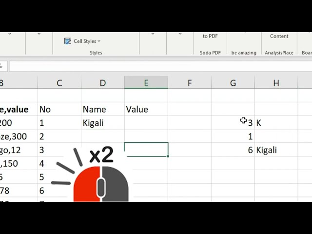
How to split data into columns? Fix messy data ease analysis and visualisation. Let me show you how to dispatch data into ...
0 views
Are you drowning in data but starving for insights? If you are spending hours copy-pasting data into Excel every month to ...
14 views
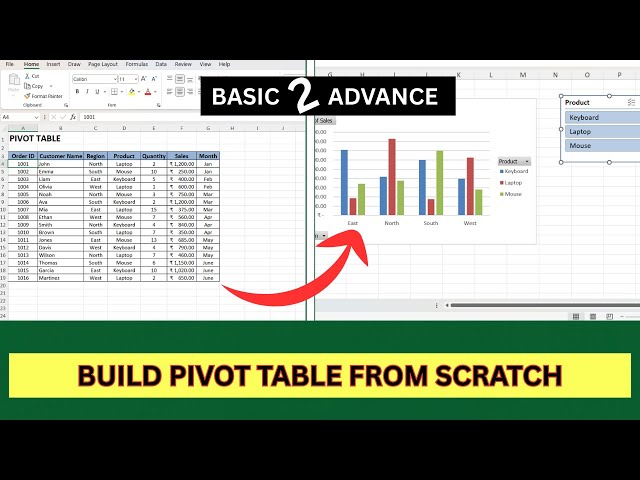
Learn how to create and use Pivot Tables in Excel step-by-step! In this video, you'll discover how to summarize, analyze, and ...
Experience the most powerful evolution of Excel yet with Copilot in Excel, your new AI partner for instant insights and smarter ...
966 views
4 days ago
... with AI Integration: https://exly.live/aThW5a ◑ #Power BI & Data Visualization: https://exly.live/aThW5a ◑ #E-Learning Portal for ...
Your Power BI charts don't look bad because of data. They look bad because you're showing too many data labels. In this video ...
1,128 views
Data Analyst Roadmap 2026 | Should You Become a Data Analyst in 2026? ---------------------------------------------------- SOCIAL ...
6,624 views
My Microsoft Excel Playlist: https://www.youtube.com/playlist?list=PLHrw3fxxgFBRyH308kfvRZnAIevkaKkf0 Want to create ...
15,035 views
Back when I was a data journalist at the Guardian, I worked on an investigative piece meant to expose the lies Big Tobacco ...
Flourish (featured on Quasa.io/projects/flourish) is a powerful, user-friendly data visualization platform that lets anyone turn ...
15 views
Description: Master the Excel Waterfall Chart and take your data visualization skills to the next level! In this video, we'll show you ...
8 views
... a Data Analyst ✓ Excel for Data Analysis (Beginner → Advanced) ✓ SQL for Data Analysis ✓ Power BI / Data Visualization ...
17 views
7 days ago
In this video, we're breaking down everything you need to know about Excel Pivot Tables to help you turn raw data into insightful ...
48 views
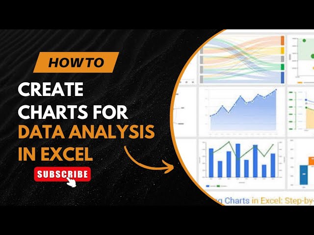
Unlock the power of data visualization in Excel! In this video, we explore how to effectively use charts for data analysis, ...
1 day ago
My Microsoft Excel Playlist: https://www.youtube.com/playlist?list=PLHrw3fxxgFBRyH308kfvRZnAIevkaKkf0 Are your Excel charts ...
1,969 views
2 days ago