ViewTube

ViewTube
Sign inSign upSubscriptions
Filters

Upload date

Type

Duration

Sort by

Features

Reset

2,211,508 results

JetBrains Academy
Data Visualization in Python!

Turn raw data into stunning visual stories with our new IDE course, Data Visualization in Python! If you've ever stared at a ...

0:48
Data Visualization in Python!

15,559 views

5 months ago

Funnel
What Is Data Visualization? (Simple Explanation) #Shorts #marketingtips

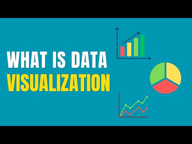
What is data visualization I'll explain it without the buzzwords simply put it's the process of taking data and turning it into graphs ...

0:42
What Is Data Visualization? (Simple Explanation) #Shorts #marketingtips

18,889 views

2 years ago

Excel Dictionary
How to visualize data with Python in Excel. 🤯 #excel  #python #tutorial

Saw the intern visualizing his data like this so I showed him this tip activate python store your data as a python data.

0:38
How to visualize data with Python in Excel. 🤯 #excel #python #tutorial

83,997 views

1 year ago

Graphy
We've read every book there is on data storytelling and here's what you need to get started

Check out our Data Storytelling platform at graphy.app/

0:25
We've read every book there is on data storytelling and here's what you need to get started

15,236 views

1 year ago

AI Make Money Tools
3 AI Tools for Data Visualization Everyone Should Try

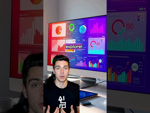
3 AI Tools for Data Visualization Everyone Should Try #makemoneywithai Stop wasting hours on tasks that AI can handle in ...

0:20
3 AI Tools for Data Visualization Everyone Should Try

162,519 views

1 year ago

ExcelTricks14
Data visualization in excel | 2 Easy data visualization tools |

Data visualization in excel | 2 Easy data visualization tools |

0:08
Data visualization in excel | 2 Easy data visualization tools |

98,457 views

3 years ago

Jon Sandmann
Power BI Dashboard Design #powerbi #datavisualization #dataanalytics #datavisualization
0:09
Power BI Dashboard Design #powerbi #datavisualization #dataanalytics #datavisualization

1,196,552 views

2 years ago

Janice Journal
3D Art & Data Visualization = 🤯😎 #3dart #datascience #maps

... see how data and 3D can really help us visualize a lot of things that we can't really imagine and also understanding how history ...

0:46
3D Art & Data Visualization = 🤯😎 #3dart #datascience #maps

31,225 views

3 years ago

Domestika English
LEARN DATA VISUALIZATION and INFORMATION DESIGN - A Course by Federica Fragapane | Domestika English

Bring clarity to complexity by creating an engaging data visualization piece that communicates information with ease: ...

2:58
LEARN DATA VISUALIZATION and INFORMATION DESIGN - A Course by Federica Fragapane | Domestika English

36,335 views

4 years ago

Domestika English
Creative Data Visualization for Beginners - Course by Gabrielle Merite | Domestika English

Learn to create captivating narratives by combining digital illustration and collage techniques to design informative and ...

2:24
Creative Data Visualization for Beginners - Course by Gabrielle Merite | Domestika English

9,800 views

3 years ago

Fireship
D3.js in 100 Seconds

... charts, and other data visualizations you see on the web today. https://fireship.io/lessons/realtime-charts-d3-firebase/ #javascript ...

2:20
D3.js in 100 Seconds

591,138 views

4 years ago

Alex The Analyst
Don’t jump into Power BI first

... to really understand how data is stored and how to transform that data before you even think about creating data visualizations.

0:48
Don’t jump into Power BI first

433,353 views

7 months ago

Upskill
Data Visualization Basics

In this video we will go through the basics of data visualization. The different ways in which you can transform your data into ...

1:43
Data Visualization Basics

527 views

2 years ago

Piotr Paszek
Interactive data visualization of the hierarchical data structure - D3.js

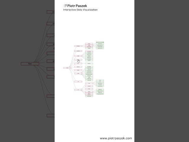
This is the interactive visualization of the hierarchical data related to the filesystem. Nodes and links are drawn using the D3.js ...

0:12
Interactive data visualization of the hierarchical data structure - D3.js

27,025 views

3 years ago

Coefficient
Notion Charts Are Limited — Here’s The Best Way to Visualize Your Notion Data

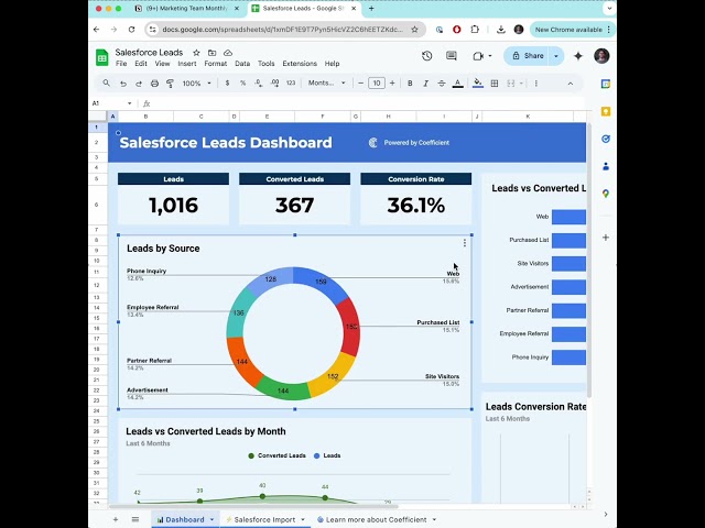
If you've tried Notion Charts, you know they're limited in flexibility and customization. In this video, we'll show you a better way to ...

0:28
Notion Charts Are Limited — Here’s The Best Way to Visualize Your Notion Data

6,659 views

11 months ago

Data Tutorials
Real Time Power BI Project, Blinkit Analysis #powerbi #powerbidashboard #dataanalyst
0:15
Real Time Power BI Project, Blinkit Analysis #powerbi #powerbidashboard #dataanalyst

1,610,835 views

1 year ago

Avery Smith | Data Analyst
Tableau is easier than you think. You can learn this in 1 hour.

Tableau is easier than you think. You can learn this in 1 hour. #tableau #dataanalyst #dataanalytics #tech #datascience #dataviz ...

0:53
Tableau is easier than you think. You can learn this in 1 hour.

202,188 views

2 years ago

David Fortin
How to Create Dashboards with Copilot in Excel

How to build insightful Dashboards in Excel with the help of Microsoft Copilot, a powerful AI tool. Copilot Essentials in 15 minutes ...

0:27
How to Create Dashboards with Copilot in Excel

633,096 views

1 year ago

Kite
HOW TO USE Matplotlib in 4 MINUTES (2020 Python Tutorial)

Matplotlib is a popular library for creating graphs, plots, and other data visualizations. People use visualization libraries like ...

3:54
HOW TO USE Matplotlib in 4 MINUTES (2020 Python Tutorial)

174,033 views

6 years ago

Elastic
Creating your first visualization with Kibana Lens

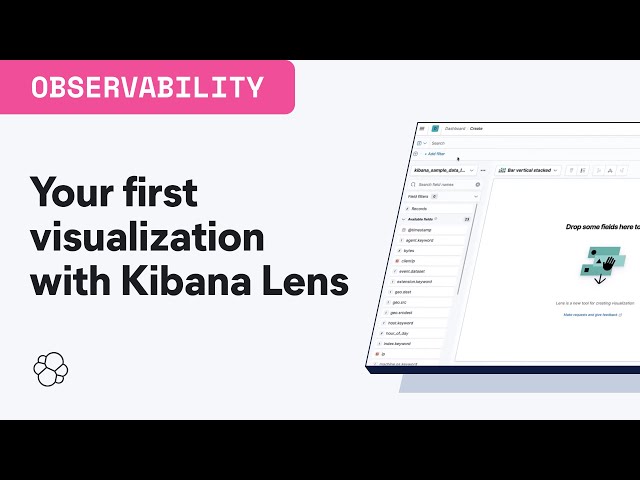
Kibana is your window into the Elastic Stack. It allows you to visualize the data that sits in Elasticsearch. In this video, you will ...

3:06
Creating your first visualization with Kibana Lens

122,642 views

4 years ago