Upload date
All time
Last hour
Today
This week
This month
This year
Type
All
Video
Channel
Playlist
Movie
Duration
Short (< 4 minutes)
Medium (4-20 minutes)
Long (> 20 minutes)
Sort by
Relevance
Rating
View count
Features
HD
Subtitles/CC
Creative Commons
3D
Live
4K
360°
VR180
HDR
4,790 results
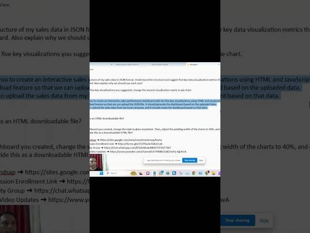
#exceldashboard #ChatGPT #ExcelTips #ExcelAutomation #DataVisualization #MicrosoftExcel #ProductivityHacks #AIInExcel ...
425 views
1 year ago
ChatGPT is revolutionizing the way we work with data. This video will demonstrate how to leverage its power to transform complex ...
35 views
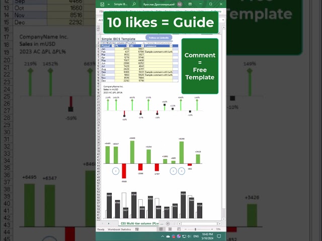
Chart Template for Plan vs Actual Comparisons: Showcase Simple IBCS-Style Chart Template ...
1,838 views
Excel Waterfall Chart: Beginner's Guide Learn how to create a waterfall chart in Excel with this beginner's guide! Waterfall charts ...
45,236 views
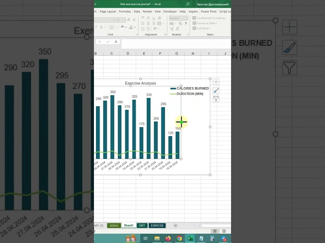
Enhanced Data Visualization with 3D Line Charts 3D Line Charts for Data Insights Discover the power of 3D line charts for ...
49 views
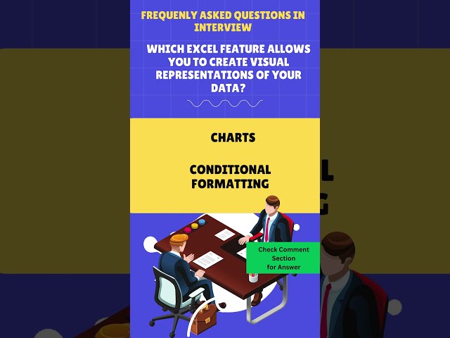
In the realm of Excel's powerful features lies a tool that transforms raw data into insightful visual representations - Charts. When it ...
55 views
Did you know you can use the pandas Python library inside Microsoft Excel to conduct advanced statistical modeling? Watch here ...
43,671 views
2 years ago
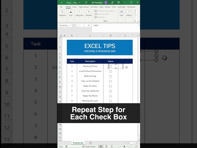
... #Checkboxes #ExcelTips #HowTo #DataVisualization #SpreadsheetSkills #MicrosoftExcel #Interactive #RealTimeUpdates.
1,586 views
Excel Chart Cleaning Tips Effective data visualization is crucial for conveying information. While Excel ...
137 views
How to Change Theme Colors in Excel Want to customize the look of your Excel spreadsheets? Learn how to change theme ...
3,463 views
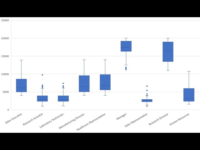
In this video I demonstrate how to create a boxplot using Microsoft Excel 365.
76,534 views
6 years ago
Simple Combo chart in Excel for data visualization #shorts #1million hey everyone! In this video, I'll show you how to make ...
64 views
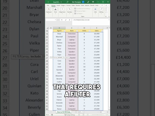
Support Me & More: linktr.ee/benthompsonuk In this video, we will show you why it's time to say goodbye to filters and embrace ...
2,396 views
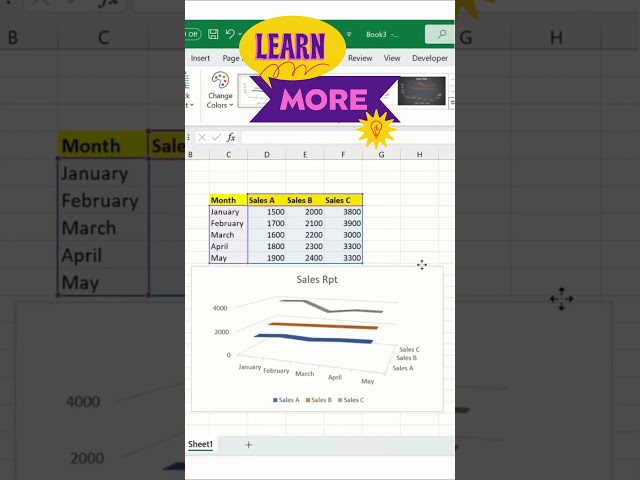
Learn how to quickly insert a sales chart in Excel and visualize your data effectively! This short tutorial will guide you through the ...
443 views
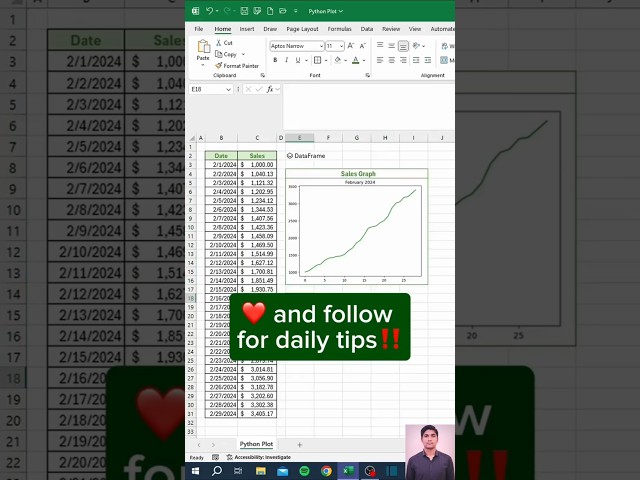
convert table to graph in Excel, Excel graphs, Excel charts, Excel for beginners, Excel tutorial, Excel tips and tricks, Excel Point ...
45 views
11 months ago
linktr.ee/benthompsonuk Are you looking to streamline your Excel data organisation process? Look no further than this tutorial on ...
1,635 views
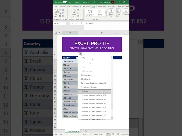
Support Me & More: linktr.ee/benthompsonuk In this tutorial, you will learn how to convert an Excel list to geographic data, ...
1,048 views
... other teams in Excel in and of itself can do a lot you can do Advanced calculations you can do visualizations you can pivot data ...
19,837 views
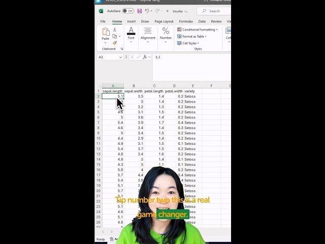
You can now visualize your data using Python in Excel! + = Watch here as Anaconda's Sophia Yang walks through three ...
23,883 views
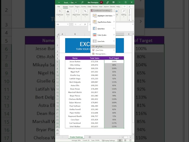
... More Tutorials ▻ https://youtube.com/EssentialExcel #ExcelTips #DataVisualization #Heatmaps #ExcelTutorial #MicrosoftExcel ...
1,833 views