Upload date
All time
Last hour
Today
This week
This month
This year
Type
All
Video
Channel
Playlist
Movie
Duration
Short (< 4 minutes)
Medium (4-20 minutes)
Long (> 20 minutes)
Sort by
Relevance
Rating
View count
Features
HD
Subtitles/CC
Creative Commons
3D
Live
4K
360°
VR180
HDR
565 results
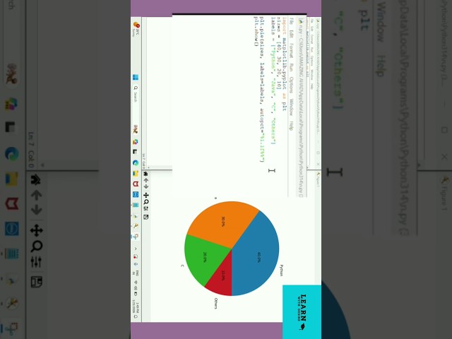
Visualize data using Matplotlib. #matplotlib #python #shorts.
19 views
21 hours ago
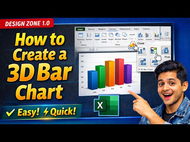
Learn how to create a 3D bar chart in Excel quickly and professionally in this step-by-step tutorial. In this video, you will discover ...
0 views
1 day ago
Tableau is one of the most powerful data visualization and business intelligence (BI) tools used by organizations to transform raw ...
4 days ago
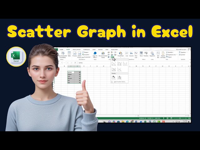
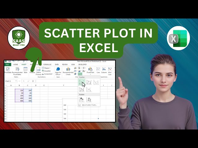
️⃣ #ExcelTutorial #DataVisualization #ScatterPlot This tutorial provides a clear, step-by-step guide on how to draw a scatter ...
48 views
6 days ago
The goal of this data visualization project was to use a song as a dataset and visualize how a guitar works from multiple ...
In this video, you will learn: ✓ Excel for Data Analysis ✓ Power BI for Data Visualization ✓ SQL for Database Querying ✓ Python ...
... #sql #tableau #datavisualization #exceltraining #dataanalysis #excelwithchatgpt #officeproductivity #exceltips #googleSheets ...
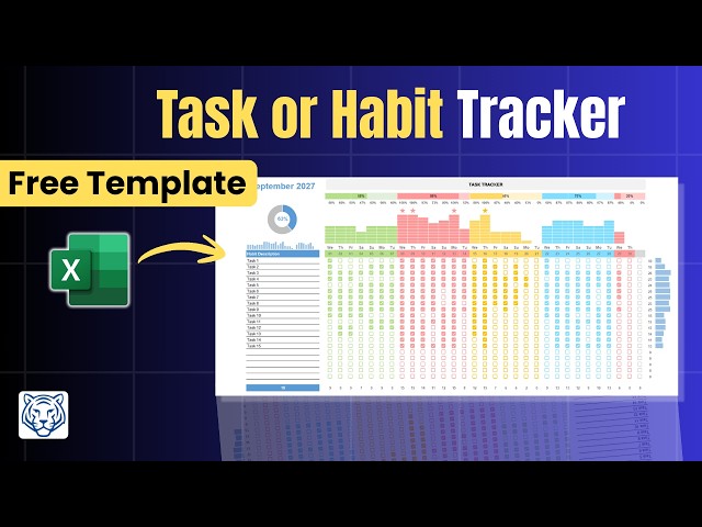
Stop juggling scattered to-do lists and start visualizing your progress with this professional Excel Habit and Task Tracker.
106 views
Excel #ScatterPlot #DataAnalysis Learn how to draw a scatter plot in Excel with this step-by-step tutorial. This video shows you ...
4 views
This quick excel tutorial shows you how to add a color scale to data in Excel. Learn how to use the 'Quick Analysis' button or the ...
2 days ago
[0:00 - 0:20] The "First Video" Hook "Stop watching boring math lectures. Most Machine Learning courses fail because they ...
10 views
How to Add Images to Data Cards in Power BI, Add Images to Data Cards Power BI, Power BI Data Cards Images, Insert Images ...
5 days ago
The roadmap covers the most important tools and concepts for data analytics, including Excel, SQL, data visualization, Power ...
20 views
7 days ago
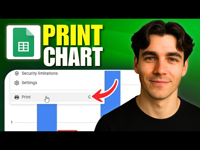
... step by step print Google Sheets chart, print data visualization in Google Sheets ➖➖➖➖➖➖➖➖➖➖➖➖➖➖➖ Some links ...
Power BI,Power BI Desktop,Power BI Tutorial,Power BI 2026,Power BI Presentation Mode,Presentation Mode,Full Screen Mode ...
Title/Focus: Data Analyst vs Data Scientist – Roadmap 2026 Description: Explore the ultimate career roadmap for Data Analysts ...
Learn how to connect Schneider Control Expert to Node-RED Dashboards using Modbus TCP for real-time IIoT data visualization.
29 views
23 hours ago
... Data Visualization Operational Reporting Dashboard Design This project demonstrates my ability to organize operational data, ...
6 views
How To Connect Google Sheets To Looker Studio As A Data Source (Tutorial 2026) I cover everything from website builders to ...
8 views
Poorly designed visuals can mislead, confuse, or even manipulate audiences. In this lesson, we examine common visualization ...


![How to Add Images to Data Cards in Power BI [2026 GUIDE]](/api/proxy/image?url=https%3A%2F%2Fi.ytimg.com%2Fvi%2FTFvX-tJiiz0%2Fsddefault.jpg)

![How to Enter Presentation Mode in Power BI Desktop [2026 GUIDE]](/api/proxy/image?url=https%3A%2F%2Fi.ytimg.com%2Fvi%2Fpfqckw8HCno%2Fsddefault.jpg)