Upload date
All time
Last hour
Today
This week
This month
This year
Type
All
Video
Channel
Playlist
Movie
Duration
Short (< 4 minutes)
Medium (4-20 minutes)
Long (> 20 minutes)
Sort by
Relevance
Rating
View count
Features
HD
Subtitles/CC
Creative Commons
3D
Live
4K
360°
VR180
HDR
178 results
In this video, you will learn how to create a stunning 3D Map in Microsoft Excel using real data. 3D Maps in Excel help you ...
8 views
1 day ago
abdullatifrkieh565.
0 views
7 days ago
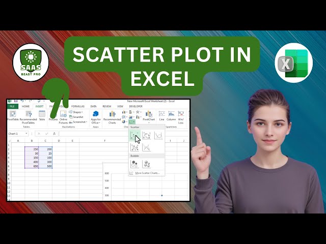
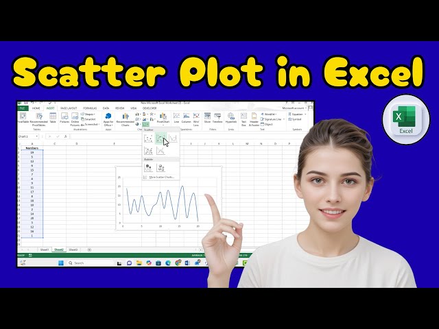
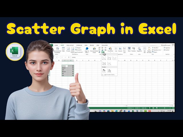
Excel #ScatterPlot #DataAnalysis Learn how to draw a scatter plot in Excel with this step-by-step tutorial. This video shows you ...
1 view
6 minutes ago
ExcelTutorial #DataVisualization #ScatterPlot Learn how to make a scatter plot in Excel to visualize relationships between your ...
6 views
5 days ago
Want to master Advanced Data Visualization in Excel? In this video, you will learn how to create professional and interactive ...
6 days ago
Welcome back to another episode of America Tech! In this tutorial, you will learn how to move from Excel to Power BI and build ...
7 views
3 hours ago
Learn Excel step-by-step for data analysis and real-world analyst tasks in this complete tutorial designed for beginners and ...
5,074 views
Streamed 9 hours ago
In this video, "How to Build Power Pivot Models in Excel | Excel Tutorial", I'll walk you through the exact steps you need to take to ...
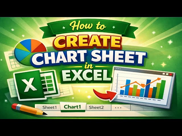
Topics covered: • Creating charts in Excel • Moving chart to a new sheet • Creating chart sheet • Excel data visualization tips ...
2 hours ago
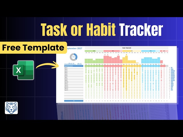
Stop juggling scattered to-do lists and start visualizing your progress with this professional Excel Habit and Task Tracker.
70 views
2 days ago
In this project, I built an interactive Microsoft Excel dashboard to analyze job market trends and extract meaningful insights from ...
4 days ago
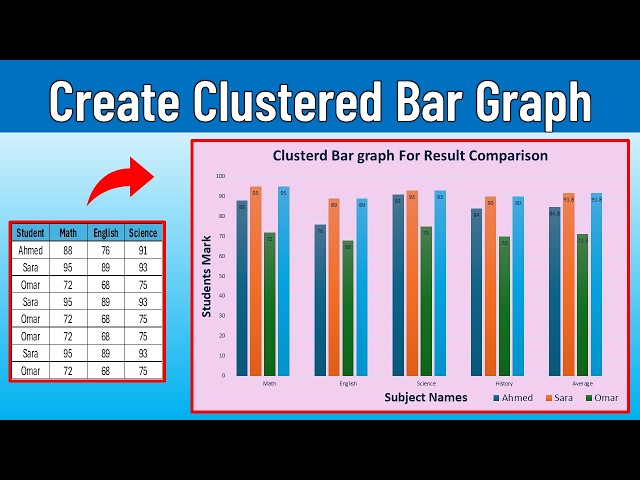
Create a clean, professional clustered bar chart in Excel with multiple data points (multiple series) in minutes. In this tutorial, you'll ...
168 views
Listen to the full episode on @thefpandaguy #FPandA #DataVisualization #FinanceLeadership #DashboardDesign #Analytics ...
8 hours ago
Hello This video demonstrates my ability to transform raw data into an interactive dashboard using Microsoft Excel and SQL.
️⃣ #ExcelTutorial #DataVisualization #ScatterPlot This tutorial provides a clear, step-by-step guide on how to draw a scatter ...
27 views
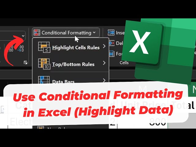
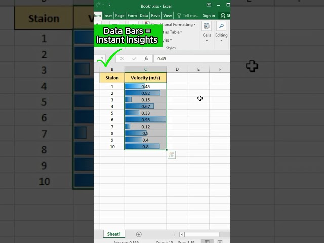
Learn how to use conditional formatting in Excel to automatically highlight data based on rules and conditions. This tutorial shows ...
Are you tired of looking at endless columns of numbers in your research? Whether you are analyzing your research data or ...
854 views
Master the art of data visualization in Excel by learning how to create pivot charts. This step-by-step guide covers selecting your ...
In this video, I explain how to create and use Pivot Charts in Microsoft Excel to transform summarized data into clear and ...
2 views
Master the art of data visualization in Excel by following our easy-to-follow guide. Learn how to accurately graph your datasets, ...