Upload date
All time
Last hour
Today
This week
This month
This year
Type
All
Video
Channel
Playlist
Movie
Duration
Short (< 4 minutes)
Medium (4-20 minutes)
Long (> 20 minutes)
Sort by
Relevance
Rating
View count
Features
HD
Subtitles/CC
Creative Commons
3D
Live
4K
360°
VR180
HDR
168,633 results
Learn how to create advanced Pie Charts, Histograms, and Subplots in Python using the Matplotlib library in this beginner-friendly ...
0 views
1 day ago
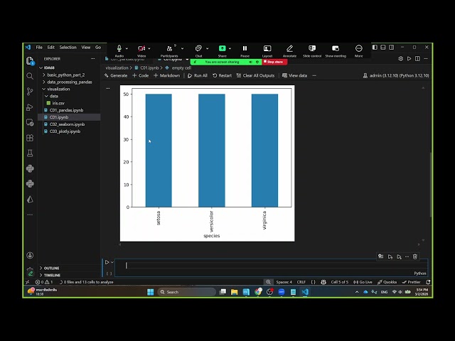
In Part 3 of this Data Visualization with Python Course 2026, you will create categorical, advanced statistical, and geospatial ...
94 views
3 weeks ago
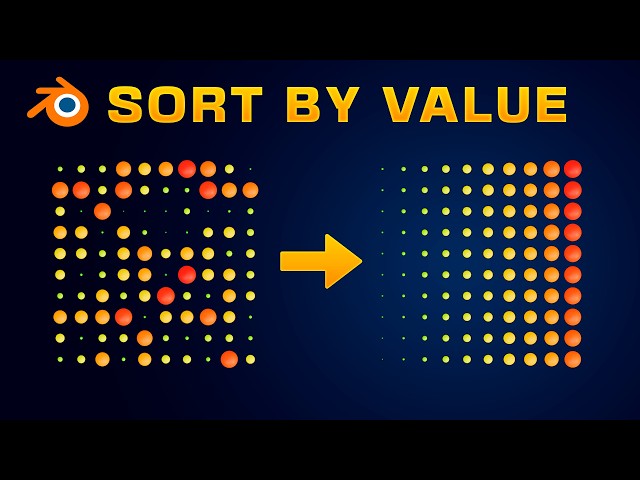
Learn how to sort and reorganize objects in Blender using Geometry Nodes based on any numerical value or attribute. In this ...
3,100 views
2 weeks ago
Most people misunderstand data visualization jobs. When you hear “data visualization,” you probably think dashboards, charts, ...
74 views
In Part 2 of this Data Visualization with Python Course 2026, you will learn how to visualize data distributions, relationships, and ...
123 views
In Part 4 of this Data Visualization with Python Course 2026, you will learn how to customize and style charts for clarity, readability, ...
64 views
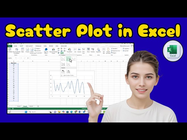
️⃣ #ExcelTutorial #DataVisualization #ScatterPlot Learn how to draw a scatter diagram in Excel to visualize relationships ...
8 views
Master NumPy & Matplotlib in One Video | Full Beginner Tutorial Now here's a powerful YouTube description you can copy: In ...
12 days ago
In this video, we explain how to use Matplotlib for Data Visualization in Python. Topics Covered: What is Matplotlib? Creating Line ...
2 views
3 views
8 days ago
Data Analyst Masters Program (Discount Code - YTBE15) ...
1,100 views
Streamed 1 month ago
Okay i'll just put it here and I'm going to go to data visualizations okay and you can uh download the zip files okay and then I can ...
34 views
10 days ago
ExcelTutorial #DataVisualization #ScatterPlot Learn how to make a scatter plot in Excel to visualize relationships between your ...
7 views
Google Looker Studio is a free data visualization and business intelligence tool developed by Google. It allows users to transform ...
88 views
3 days ago
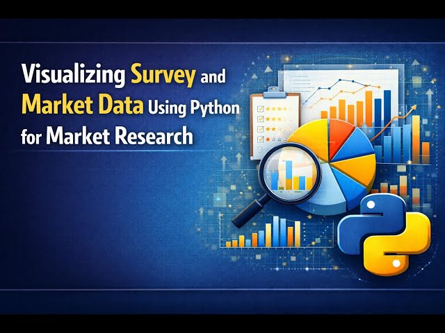
Learn how to visualize survey and market data effectively with Python techniques for market research analytics. This tutorial ...
17 views
Link: https://autodash.art.
1 month ago
This video walks through how to run a RuFaS simulation by creating biophysical input files, linking metadata and file paths, and ...
26 views
6 days ago
Welcome to the Looker Tutorial. This comprehensive Looker Course is designed to take you from a complete beginner to a data ...
227 views
This video introduces data visualization in Python, showing how to plot your data for better insights. You'll learn how to create ...
Welcome to Lecture 6 of our Power BI Masterclass! Now that we've cleaned our data, it's time for the most exciting part: ...
93 views
0
Welcome to this step-by-step tutorial on how to design pie charts in Figma! Creating beautiful, accurate data visualizations ...
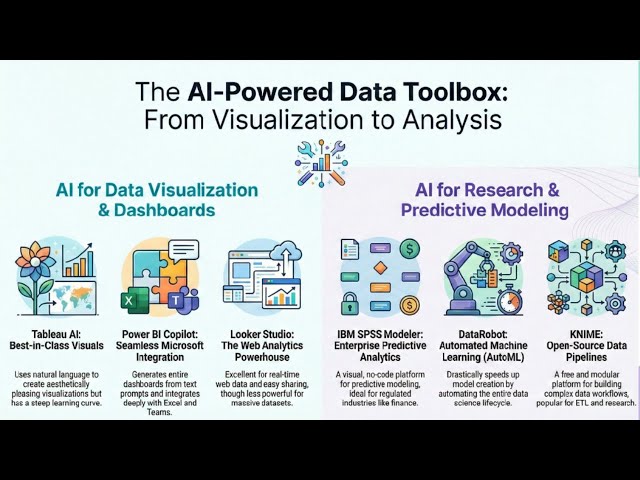
AI Tools For Data Visualization: From Analysis to Visualization @MedResearch-bz In today's data-driven world, visualization is no ...
40 views
Data is everywhere — but insight is rare. On this channel, we go beyond charts and dashboards. We explore how to transform raw ...
This recorded workshop from UC Love Data Week 2026 will introduce you to the transformative potential of AI-assisted data ...
87 views

![Data Visualization with Python Course [2026] - Part 3: Categorical, Statistical & Geospatial Charts](/api/proxy/image?url=https%3A%2F%2Fi.ytimg.com%2Fvi%2FR4mnsA5dctU%2Fsddefault.jpg)
![Data Visualization with Python Course [2026] - Part 2: Distribution & Time Series Charts](/api/proxy/image?url=https%3A%2F%2Fi.ytimg.com%2Fvi%2Ftaa64u_CcYk%2Fsddefault.jpg)
![Data Visualization with Python Course [2026] - Part 4: Chart Customization & Styling](/api/proxy/image?url=https%3A%2F%2Fi.ytimg.com%2Fvi%2FQy26YmM9KTg%2Fsddefault.jpg)

![Tableau Data Visualization Full Course 2026 [FREE] | Data Visualization Using Tableau | Simplilearn](/api/proxy/image?url=https%3A%2F%2Fi.ytimg.com%2Fvi%2Fwy3UTyTCmDY%2Fsddefault.jpg)