Upload date
All time
Last hour
Today
This week
This month
This year
Type
All
Video
Channel
Playlist
Movie
Duration
Short (< 4 minutes)
Medium (4-20 minutes)
Long (> 20 minutes)
Sort by
Relevance
Rating
View count
Features
HD
Subtitles/CC
Creative Commons
3D
Live
4K
360°
VR180
HDR
730 results
excelshorts #excel #excelmis #exceltutorial #MIS MS Excel Excel Inertview questions and answers MS excel full course in hindi ...
0 views
6 days ago
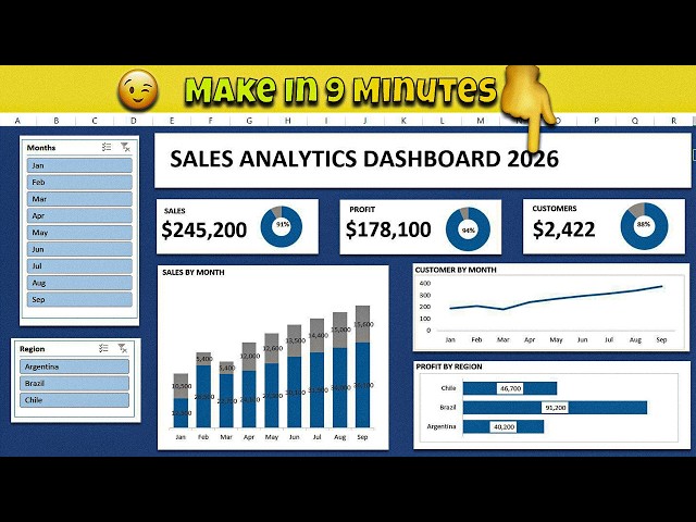
Learn how to create a professional and interactive Excel Sales Analytics Dashboard in just 9 minutes! This step-by-step tutorial ...
149 views
4 days ago
Covering Excel data analysis using PivotTables, Solver, and Power Pivot. They explain data modeling, statistical functions, and ...
1 view
7 days ago
Conditional Formatting helps you understand Excel data at a glance. In this video, you'll learn how to use Icon Sets and Data Bars ...
2 views
10 hours ago
In this video you will learn how to create and use a Pivot Table and Chart in Microsoft Excel. Learning how to use the PivotChart ...
63 views
3 days ago
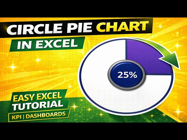
Excel Circle Pie Chart | Better Way to Show Progress Percentage Circle Pie Chart for KPI Dashboard in Excel | No Donut Chart ...
65 views
Let's learn how to create graph and sparkline in excel.
It's true how visuals speak louder than numbers. I created this dynamic sex ratio dashboard to represent demographic data in a ...
50 views
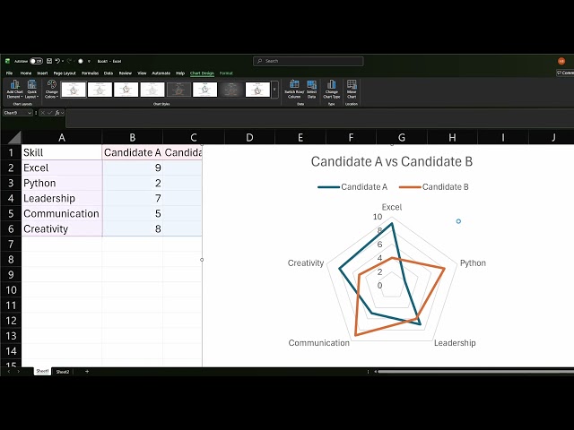
In this video, I walk you through exactly how to create a radar/spider chart and format it to look professional. CALCULATORS ...
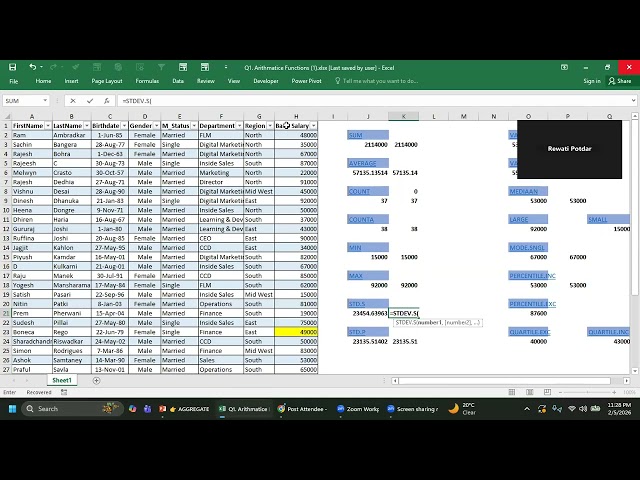
Excel Aggregate Functions | Data Visualization Basics Learn Data with Rewati Welcome to Learn Data with Rewati In this video ...
98 views
In this video, I showcase a complete Coffee Shop Excel Dashboard project. Tools Used: - Microsoft Excel - Power Query - VBA ...
22 hours ago
Hey there! I'm IsholaDeAnalyst, a data analyst who's been in your shoes—overwhelmed by spreadsheets and endless lines of ...
3 views
Learn how to insert and use Sparklines in Excel! In this tutorial, I'll show you step-by-step how to create Line, Column, and ...
10 views
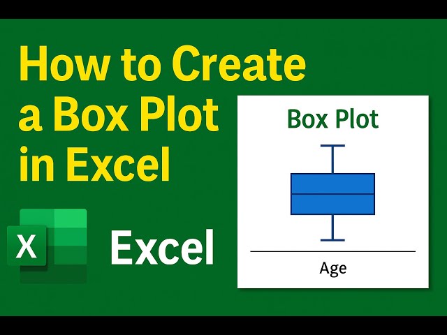
Learn how to create a box plot in Excel to visualize data distribution, spot outliers, and understand ranges. This step-by-step ...
28 views
CALCULATORS | Amazon Affiliate Links Best Overall:TI-84 Plus CE (Approved for SAT/ACT/College Exams): ...
5 views
Sponsored By TechLift Academy.
37 views
5 days ago
Link to download Power BI Desktop: https://www.microsoft.com/en-us/download/details.aspx?id=58494 Unlock the power of ...
The course covers essential BA tools, data visualization concepts, and real-world use cases to bridge the gap between business ...
1,209 views
Streamed 1 day ago
Data Analyst Masters Program (Discount Code - YTBE15) ...
385 views
2 days ago
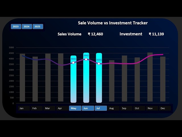
Visualize quarterly performance with an interactive block chart Powered by dynamic formulas and conditional formatting ...
9 views
Like | Comment | Subscribe for more Excel & Data Visualization tutorials #Excel #ExcelCharts #DataVisualization #Analytics ...
4,655 views
1 day ago
Formatting dashboards and charts in Excel takes hours. Watch how Ajelix AI agents turn raw data into stunning, professional ...
4 views
1,720 views
Create professional flowcharts directly from Excel spreadsheets in seconds — no manual diagramming or design skills needed!
hiData for Excel lets you understand your data just by asking questions. Type in plain English, and your spreadsheet turns into ...


![Business Analysis With Excel Full Course 2026 [FREE] | Business Analytics With Excel | Simplilearn](/api/proxy/image?url=https%3A%2F%2Fi.ytimg.com%2Fvi%2Fc1NJg_1mDIY%2Fsddefault.jpg)
![Tableau Data Visualization Full Course 2026 [FREE] | Data Visualization Using Tableau | Simplilearn](/api/proxy/image?url=https%3A%2F%2Fi.ytimg.com%2Fvi%2Fv4SpTOC4ZN0%2Fsddefault.jpg)


![Tableau Data Visualization Full Course 2026 [FREE] | Data Visualization Using Tableau | Simplilearn](/api/proxy/image?url=https%3A%2F%2Fi.ytimg.com%2Fvi%2F40tEqp7OdIM%2Fsddefault.jpg)