ViewTube

ViewTube
Sign inSign upSubscriptions
Filters

Upload date

Type

Duration

Sort by

Features

Reset

119 results

Data Universe
End-to-End Power BI Sales Dashboard (Step-by-Step) | DAX, Data Modeling & KPIs

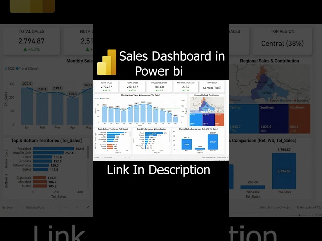
Learn how to create an End-to-End Power BI Sales Dashboard step by step. This beginner-friendly Power BI tutorial takes you ...

0:05
End-to-End Power BI Sales Dashboard (Step-by-Step) | DAX, Data Modeling & KPIs

0 views

8 hours ago

Techie Dialogue
How To Make a Graph in Illustrator | Data to Visuals (2026)

Illustrator #GraphDesign #DataVisualization Learn how to make a graph in Illustrator with this step-by-step tutorial. We'll show ...

1:01
How To Make a Graph in Illustrator | Data to Visuals (2026)

0 views

59 minutes ago

Jellyman Education
Scatter Plots with Shapes and Colour

WANT TO BECOME A DATA ANALYST USING TABLEAU? Join 100000+ students learning real-world analytics skills (not theory).

1:26
Scatter Plots with Shapes and Colour

72 views

15 hours ago

The Power BI Guy
CLAUDE Writes Your Power BI Documentation AUTOMATICALLY (Save 20 Hours)

Download the Document Prompt FREE Power BI Beginner to Intermediate course (6+ Hours) ...

10:18
CLAUDE Writes Your Power BI Documentation AUTOMATICALLY (Save 20 Hours)

565 views

16 hours ago

Databricks
Genie Code for AI/BI Dashboards - product demo (no audio)

Watch Genie Code for AI/BI Dashboards in action. This product demo shows how Genie Code acts as an autonomous AI agent to ...

0:42
Genie Code for AI/BI Dashboards - product demo (no audio)

227 views

12 hours ago

Excel Booster
Variance Column Bar Chart in Excel #excel #exceltips

Variance Column Bar Chart in Excel Learn how to create a Variance Column Bar Chart in Excel to compare Target vs Sales ...

1:15
Variance Column Bar Chart in Excel #excel #exceltips

0 views

7 hours ago

AGRON Info-Tech
K-means Clustering in R (Elbow + Silhouette + Customer Segmentation) | Real Data

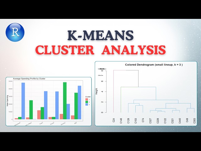
K-means is everywhere in data science, but most people choose k the wrong way. In this AGRON Info Tech tutorial, we use a real ...

10:47
K-means Clustering in R (Elbow + Silhouette + Customer Segmentation) | Real Data

12 views

11 hours ago

Learn Microsoft Office with Helen Bradley
Excel Map Tutorial for Beginners - Easy & Fast to Make

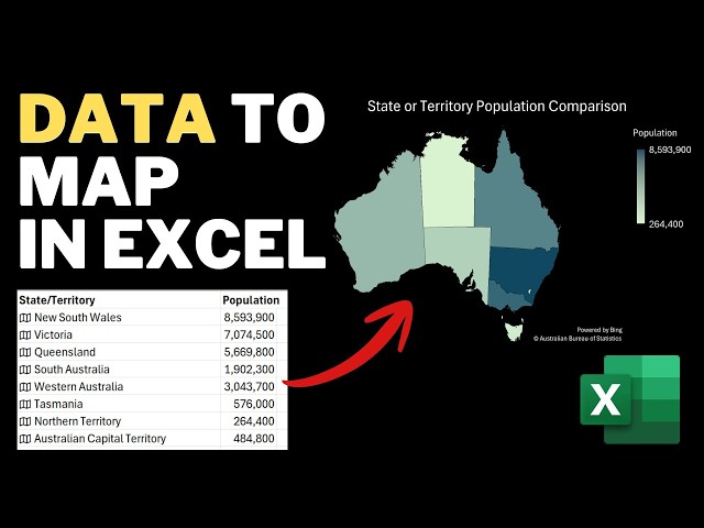
Excel Map Tutorial for Beginners - Easy & Fast to Make In this tutorial, you will learn how to create an interactive map that plots ...

8:29
Excel Map Tutorial for Beginners - Easy & Fast to Make

6 views

13 hours ago

Tutorials With Noel
How To Connect Monday.com To Power Bi [2026 Guide]

How To Connect Monday.com To Power Bi [2026 Guide] In today's video we cover: monday.com, power bi, monday.com power bi, ...

2:02
How To Connect Monday.com To Power Bi [2026 Guide]

0 views

20 hours ago

Simplilearn
SQL Full Course 2026 | SQL Tutorial For Beginners | SQL Data Manipulation Tutorial | Simplilearn

Data Analyst Masters Program (Discount - YTBE15) ...

6:28:57
SQL Full Course 2026 | SQL Tutorial For Beginners | SQL Data Manipulation Tutorial | Simplilearn

648 views

Streamed 4 hours ago

Simplilearn
SQL Full Course 2026 | SQL Tutorial For Beginners | SQL Data Manipulation Tutorial | Simplilearn

Data Analyst Masters Program (Discount - YTBE15) ...

6:23:35
SQL Full Course 2026 | SQL Tutorial For Beginners | SQL Data Manipulation Tutorial | Simplilearn

662 views

Streamed 4 hours ago

Geojay GIS Solution
ArcGIS Layer Transparency Management Tutorial Review

ArcGIS #LayerTransparency #GIS #MappingTutorial #DataVisualization #SpatialAnalysis #GeographicInformationSystems Buy ...

0:24
ArcGIS Layer Transparency Management Tutorial Review

0 views

22 hours ago

Durga Software Solutions
Mastering Data Science Using Python

Want to start your journey in Data Science using Python? In this video, we explain the fundamentals of Data Science and how ...

8:19
Mastering Data Science Using Python

28 views

15 hours ago

Justinah Raphael-Ojo
POWER BI IN POWERPOINT: HOW TO EMBED INTERACTIVE DASHBOARDS EASILY

#excel #everythingdataanalytics #DataAnalystPortfolio #CareerTips #PowerBI #Excel #Python #SQL #DataVisualization ...

19:09
POWER BI IN POWERPOINT: HOW TO EMBED INTERACTIVE DASHBOARDS EASILY

12 views

18 hours ago

Geojay GIS Solution
Add XY Coordinates To Feature In ArcGIS Pro tutorial  Review

ArcGISPro #XYCoordinates #GIS #MappingTutorial #GeospatialAnalysis #DataVisualization #FeatureEditing Buy me a coffee ...

0:20
Add XY Coordinates To Feature In ArcGIS Pro tutorial Review

0 views

14 hours ago

Debo teamwork
CRISP-DM Explained: The Ultimate Beginner's Guide to the Data Mining Process

Welcome to the fourth installment of our Data Mining tutorial series! In this video, we dive deep into the CRISP-DM Framework ...

11:03
CRISP-DM Explained: The Ultimate Beginner's Guide to the Data Mining Process

0 views

12 hours ago

JMP Statistical Discovery
Level Up | Breaking Up with Excel

In this episode of Level Up, we shift from recognizing the limits of spreadsheets to actively demonstrating why a different approach ...

10:01
Level Up | Breaking Up with Excel

67 views

22 hours ago

Data_Analytics_Learn_More
Power BI Column Chart vs Clustered Column Chart | When to Use Each?

How to create a Column Chart in Power BI • How to create a Clustered Column Chart in Power BI • The difference between ...

43:58
Power BI Column Chart vs Clustered Column Chart | When to Use Each?

0 views

16 hours ago

Teaching Junction
How to Add Data Series to a Chart in Excel (Line Graph or Line Chart)

In this video, you will learn How to Add Data Series to a Chart in Excel (Line Graph or Line Chart). You can add one, two or ...

4:17
How to Add Data Series to a Chart in Excel (Line Graph or Line Chart)

0 views

17 hours ago

My Data Projects
Excel, SQL & Power BI Project for Data Analysts | Pharmacy Openings and Closures End-to-End Tutorial

Excel, SQL & Power BI Project for Data Analysts | Pharmacy Openings and Closures End-to-End Tutorial All links 5. Pharmacy ...

1:34:29
Excel, SQL & Power BI Project for Data Analysts | Pharmacy Openings and Closures End-to-End Tutorial

24 views

9 hours ago