Upload date
All time
Last hour
Today
This week
This month
This year
Type
All
Video
Channel
Playlist
Movie
Duration
Short (< 4 minutes)
Medium (4-20 minutes)
Long (> 20 minutes)
Sort by
Relevance
Rating
View count
Features
HD
Subtitles/CC
Creative Commons
3D
Live
4K
360°
VR180
HDR
737 results
In this session, we will learn about the following topics: 1. How to Use VLOOKUP Formula in Excel with Claude AI Step by Step 2.
24 views
2 days ago
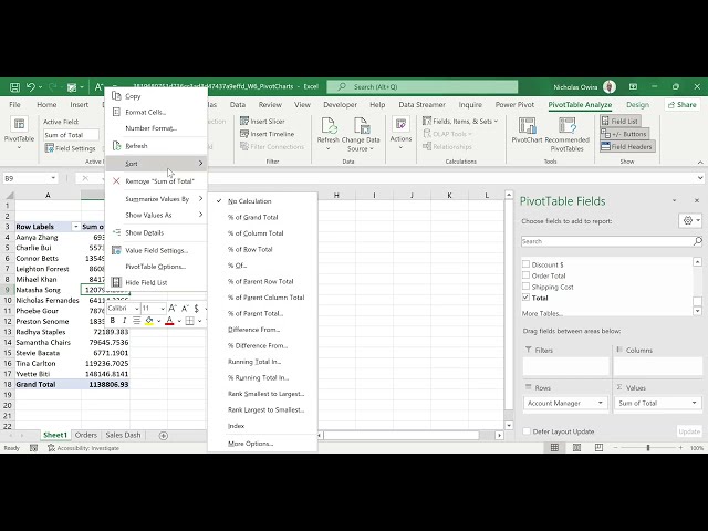
... 10:18:05 - Automate Data Tasks with power Query 10:37:36 - Charts and Graphs In Excel 10:58:37 - Excel Data Visualization ...
31,092 views
Excel vs Power BI Explained (When to Use Each Tool) The Real Difference Between Excel and Power BI Excel or Power BI?
712 views
7 days ago
Doughnut Chart in Excel | Easy Data Visualization Trick! #DoughnutChart #MicrosoftExcel #ExcelTips.
150 views
6 hours ago
In this video, I break down a complete Excel full course for beginners in 2026, showing you exactly how to use Excel step by step.
9,581 views
5 days ago
THIS VIDEO IS ABOUT INTRODUCTION TO DATA VISUALISATION.
13 views
... Top Advance Excel Questions Asked In Interviews 06:01:27 - Charts and Graphs In Excel 06:22:28 - Excel Data Visualization ...
7,772 views
3 days ago
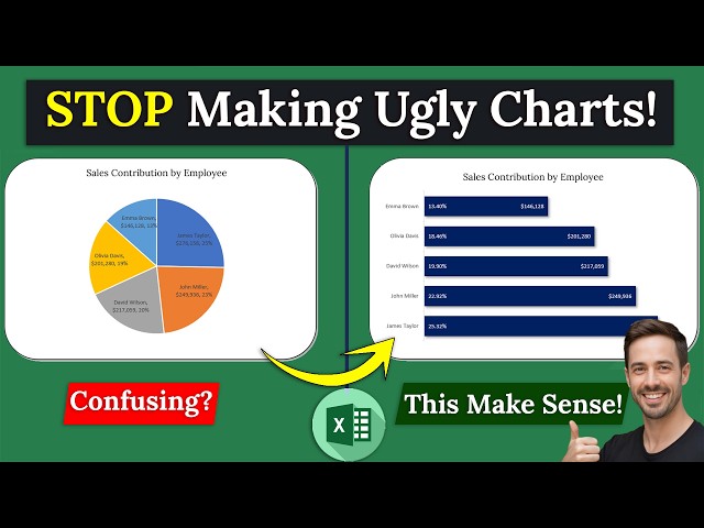
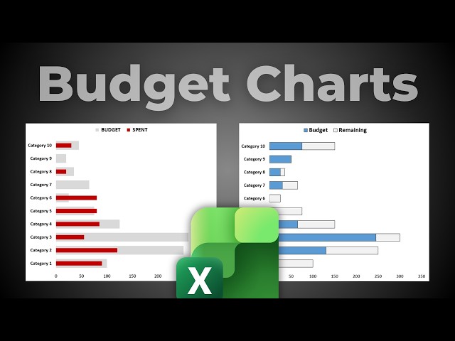
Stop Messy Excel Charts! Clean Report with % Insights Messy Excel charts? Too many numbers, too many colors, no clear ...
596 views
In this video, I will show you how to create clean and professional charts in Excel that are perfect for YouTube videos. Learn how ...
59 views
Dive into the world of data visualization as we guide you through creating comprehensive dashboards using Excel. This full-guide ...
10 views
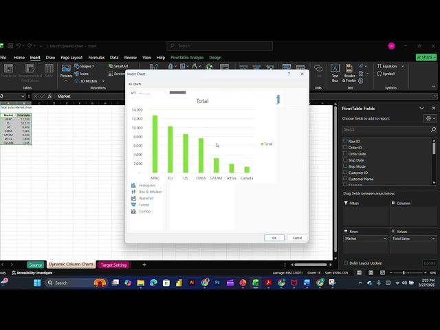
Still using static charts in Excel? Learn how to create dynamic charts that automatically update and make your data more powerful ...
1 view
Top 10 Excel Tricks Every Data Analyst Must Know (Full Masterclass) Stop just "using" Excel and start analyzing like a pro!
81 views
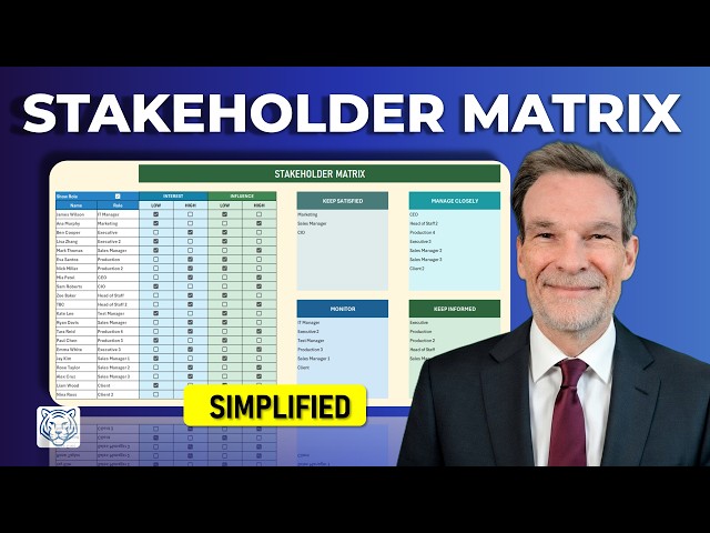
Construct a professional Stakeholder Interest and Influence Matrix in Excel to categorize project contacts into actionable ...
57 views
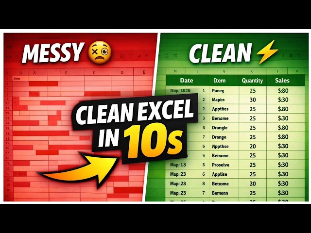
Struggling with messy Excel data? In this quick tutorial, I'll show you how to clean your data in just 10 seconds using simple ...
Topics Covered: Excel Dashboard Pivot Tables Excel Charts Slicers in Excel Data Visualization Excel for Beginners Why this ...
26 views
New Channel - https://www.youtube.com/@UC539XU3QfKXjE3cUo_dCNeA Previous Video ...
102 views
Adanced data analysis/visualization with excel. #excel #exceltips #pivot_table.
29 views
6 days ago
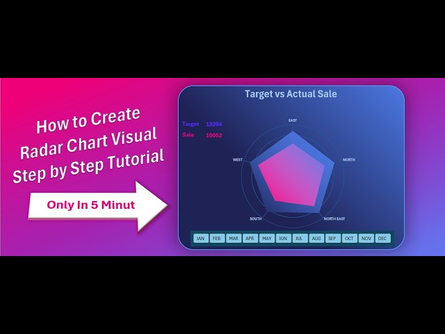
Learn how to create a professional Radar Chart in Excel to compare Target vs Actual Sales in just a few minutes. In this tutorial ...
7 views
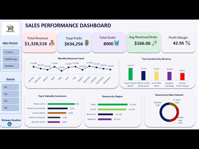
In this video, we complete the Excel Sales Dashboard project by building a fully interactive dashboard using charts, KPIs, and ...
228 views
Set-Up Info: https://media.datacamp.com/cms/set-up-info-create-a-marketing-funnel-with-excel--copilot.pdf Laura Wiedel, the ...
429 views
Streamed 5 days ago