ViewTube

ViewTube
Sign inSign upSubscriptions
Filters

Upload date

Type

Duration

Sort by

Features

Reset

45 results

Power BI Design Studio
Margins vs Padding in Power BI: Why Your Reports Don’t Look Professional

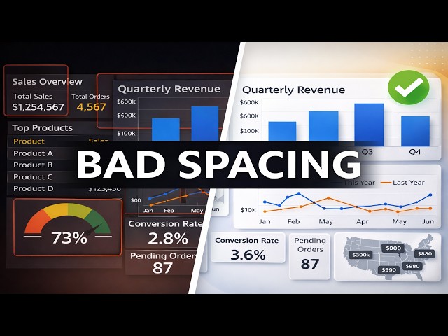
... https://youtu.be/nB_glZyINbg #powerbi #reportdesign #datavisualization #dashboarddesign #uidesign #PPCC #PPCC2026.

3:32
Margins vs Padding in Power BI: Why Your Reports Don’t Look Professional

0 views

7 days ago

Power BI Design Studio
Power BI Dashboard Design Tutorial Channel | Executive-Ready Report Design

Welcome to Power BI Design Studio. This channel is dedicated to modern Power BI dashboard design, report layout strategy, and ...

0:37
Power BI Dashboard Design Tutorial Channel | Executive-Ready Report Design

3 views

7 days ago

Abiola David - Databricks and Microsoft MVP
Visualise Geospatial Data using Microsoft Fabric Map

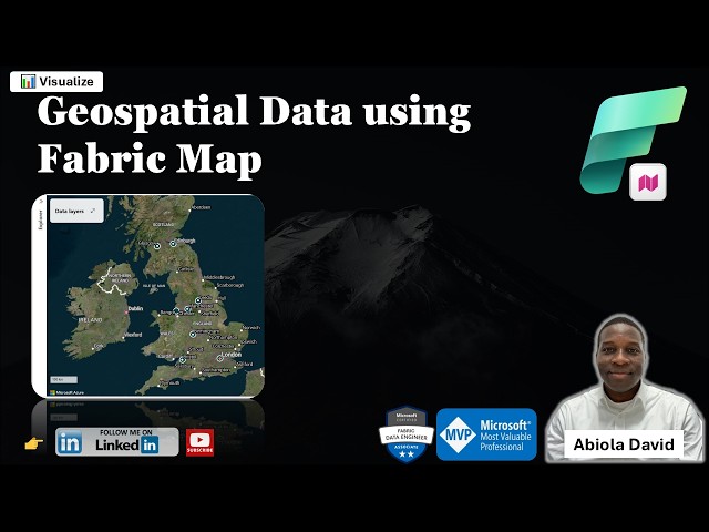
One of the exciting additions to Microsoft Fabric is the Map Item which enables teams to visualize and analyze geospatial data ...

11:53
Visualise Geospatial Data using Microsoft Fabric Map

119 views

6 days ago

Power BI Design Studio
3 Small Power BI Settings That Make a Big Design Difference

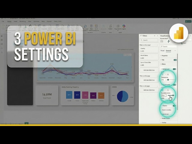
Small formatting settings can make a big difference in how professional your Power BI visuals look. In this video, I walk through ...

3:45
3 Small Power BI Settings That Make a Big Design Difference

0 views

7 days ago

Riffomonas Project
Bar plot headaches and how many words is a data visualization worth (CC405)

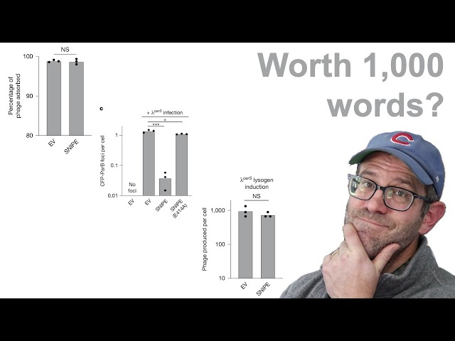
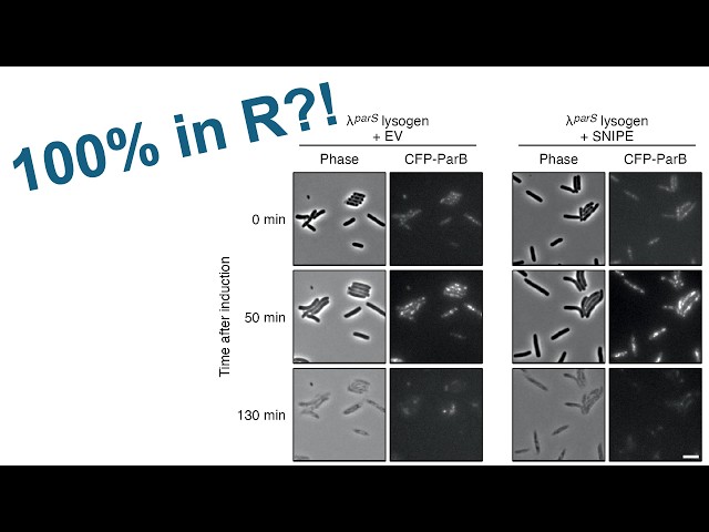
Pat critiques a set of panels from a figure published in the scientific journal Nature looking at a novel mechanism of defense used ...

27:48
Bar plot headaches and how many words is a data visualization worth (CC405)

639 views

6 days ago

The Explainer Office
How do you run a pilot of data visualization software in 14 days (practical plan)?

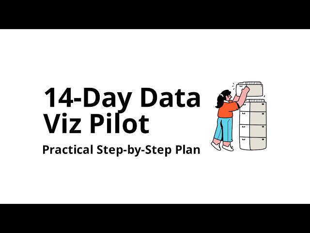
How do you run a pilot of data visualization software in 14 days (practical plan)? Learn how to run a data visualization software ...

12:22
How do you run a pilot of data visualization software in 14 days (practical plan)?

0 views

3 days ago

UK DATA SERVICE
Mapping crime data in R: Interactive introduction

Unlock the Power of Crime Mapping in R Do you want to turn raw crime data into powerful, visual insights? This workshop will ...

1:39:25
Mapping crime data in R: Interactive introduction

202 views

Streamed 5 days ago

Power BI Design Studio
How to Add a Background Layout in Power BI (5 Simple Steps)

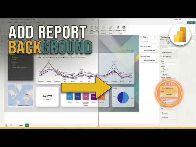
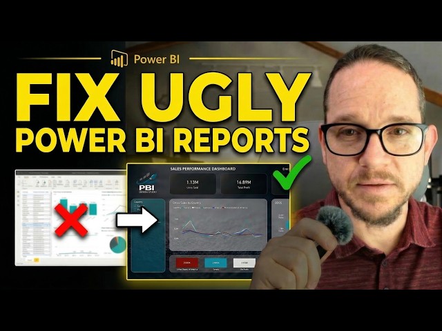
Learn how to improve your Power BI reports with effective background layouts. This power bi tutorial shows you five simple steps ...

2:38
How to Add a Background Layout in Power BI (5 Simple Steps)

0 views

2 days ago

Micah Johnson
This AI Just Replaced My Entire Data Analysis Workflow

... data sources, such as podcast analytics • Converting raw data into visual presentations • Best practices for data visualization in ...

12:09
This AI Just Replaced My Entire Data Analysis Workflow

52 views

4 days ago

Codanics
Data Analyst Jobs in Germany 🇩🇪 | Live LinkedIn Reality Check 2026

Assalam-o-Alaikum! Europe, aur khas tor par Germany mein Data Analytics ki jobs ka kya scope hai? Aaj ki is video mein hum ...

6:33
Data Analyst Jobs in Germany 🇩🇪 | Live LinkedIn Reality Check 2026

3,648 views

6 days ago

UCLA Office of Advanced Research Computing (OARC)
Creating Spatial Networks with Open Source Software

Monday, Feb 02, 2026 10:00 am - 12:00 pm Presenter: Ryan Horne Networks are everywhere, moving through digital and ...

1:00:23
Creating Spatial Networks with Open Source Software

92 views

4 days ago

AI Filmmaking Academy
Nano Banana 2 for AI Filmmakers: Real-World Research & Cinematic Workflows

Nano Banana 2 is changing AI filmmaking. It's the first ever AI image generator able to research the real world while generating ...

9:07
Nano Banana 2 for AI Filmmakers: Real-World Research & Cinematic Workflows

22,966 views

6 days ago

UK DATA SERVICE
Mapping crime data in R: hands-on coding

Unlock the Power of Crime Mapping in R Do you want to turn raw crime data into powerful, visual insights? This workshop will ...

2:00:00
Mapping crime data in R: hands-on coding

156 views

Streamed 4 days ago

RStudio for Data Science & Biostatistics
Cross sectional data description

Cross sectional data description R Programming and RStudio for Data Analysis, Epidemiology & Biostatistics Welcome to this ...

1:42
Cross sectional data description

0 views

2 days ago

Hustler's Kingdom
GMT20250607 062732 Recording 1920x1080
1:40:08
GMT20250607 062732 Recording 1920x1080

0 views

6 days ago

Nexural Trading
Qpulse Nexural Trading Indicator

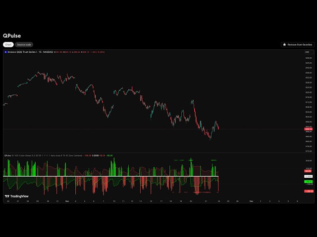
+ Discord ▻ https://discord.gg/7A4AU7HMJp + TradingView ▻ https://www.tradingview.com/u/Nexural/ In this video, I do a full ...

50:05
Qpulse Nexural Trading Indicator

152 views

6 days ago

Power BI Design Studio
The Fastest Way to Make Power BI Reports Look Professional

... #PowerBIDesign #PowerBITips #DataVisualization #BusinessIntelligence Power BI is a trademark of Microsoft Corporation.

6:13
The Fastest Way to Make Power BI Reports Look Professional

0 views

3 days ago

Riffomonas Project
Using ggplot2 to recreate a figure made up of pictures (CC406)

In this livestream, Pat refactors a panel of images from a paper recently published in Nature using two approaches that leverage ...

1:47:46
Using ggplot2 to recreate a figure made up of pictures (CC406)

509 views

Streamed 3 days ago

Hustler's Kingdom
GMT20250510 060019 Recording 1920x1080
1:34:47
GMT20250510 060019 Recording 1920x1080

5 views

7 days ago

EmperorMousy
How Many US cities can I name in 1 hour?

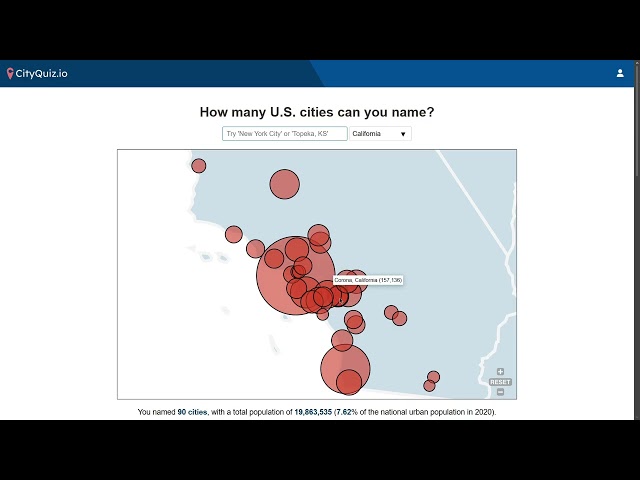
My map: https://cityquiz.io/quizzes/usa/share/2680139.

1:00:26
How Many US cities can I name in 1 hour?

3 views

5 days ago