Upload date
All time
Last hour
Today
This week
This month
This year
Type
All
Video
Channel
Playlist
Movie
Duration
Short (< 4 minutes)
Medium (4-20 minutes)
Long (> 20 minutes)
Sort by
Relevance
Rating
View count
Features
HD
Subtitles/CC
Creative Commons
3D
Live
4K
360°
VR180
HDR
81,816 results
Learn more about how the Excel Chart Styles Add-In from PolicyViz and PeltierTech works.
1,363 views
6 years ago
Excel is one of the most used skills in the data world. In this series we will be walking through all of the most important topics that ...
214,656 views
4 years ago
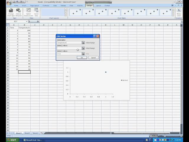
In this Microsoft Excel tutorial you will learn how to add a data series to your chart in Microsoft Excel. About The Trainer: This ...
153,105 views
5 years ago
Excel Waterfall Chart: Beginner's Guide Learn how to create a waterfall chart in Excel with this beginner's guide! Waterfall charts ...
45,534 views
1 year ago
Chart Template for Plan vs Actual Comparisons: Showcase Simple IBCS-Style Chart Template ...
1,841 views
This tutorial shows you how to make a basic graph in Excel 2007 for you chemistry lab reports. Best viewed in 720 p and ...
3,008 views
14 years ago
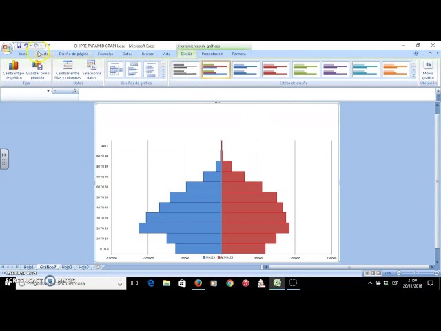
In this video you'll learn how to create a Pyramid Graph using Microsoft Office Excel.
3,587 views
9 years ago
In this Excel video tutorial, we learn how to create advanced chat that responds to dropdown list. If you enjoy the video, consider ...
633 views
How to create a multi data series line graph in Microsoft Excel 2007/2010. One of several video tutorials created for students in ...
206,407 views
13 years ago
Covering how to use a stacked bar chart to create some more flexible chart options, particularly around error bars, ranges and ...
1,075 views
3 years ago
Level up your Graphs in Excel with this step-by-step tutorial. Make your data stand out and tell a story with his unique approach to ...
230 views
Thanks for Watching! If you enjoy our videos please like, share or subscribe.
141 views
Support Me & More: linktr.ee/benthompsonuk In this tutorial I demonstrate how you can create a dynamic yet easy to implement ...
13,387 views
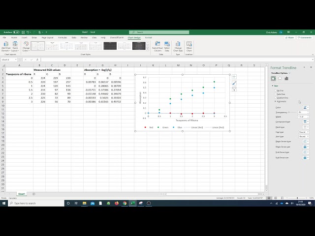
What I'm going to do now is show you how to make a graph of it. What we need to plot is teaspoons of Ribena against the three ...
690 views
How to Calculate Mean, Median and Mode in Excel 'Excel Explained: Basics' Playlist: ...
85,569 views
How to use Excel and Google Sheets to plot and analyze time/temperature kinetic data. Activation Energy.
337 views
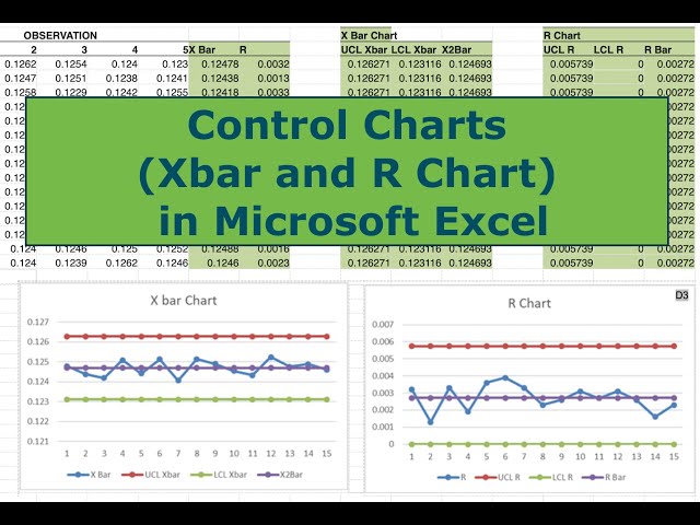
In this video I walk you through all the steps necessary to construct Control Charts (Xbar and R) in Microsoft Excel. Control charts ...
44,213 views
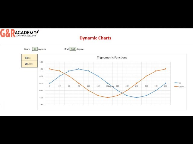
This video tutorial provides 2 ways to make excel charts dynamic: 1. Changing the range of the chart which can help zoom in and ...
1,618 views
7 years ago
Did you know how to add a target line in Excel chart?! Please don't forget to like and subscribe for more content! If you have any ...
2,165 views
In this tutorial you can learn How To Draw A Graph In Excel. Please subscribe my channel and keep in touch... Thanks.
2,228 views


![Dynamic Advanced Chart with Data Validation [Excel File link]](/api/proxy/image?url=https%3A%2F%2Fi.ytimg.com%2Fvi%2F0bBAmdd9YiA%2Fsddefault.jpg)