Upload date
All time
Last hour
Today
This week
This month
This year
Type
All
Video
Channel
Playlist
Movie
Duration
Short (< 4 minutes)
Medium (4-20 minutes)
Long (> 20 minutes)
Sort by
Relevance
Rating
View count
Features
HD
Subtitles/CC
Creative Commons
3D
Live
4K
360°
VR180
HDR
1,468 results
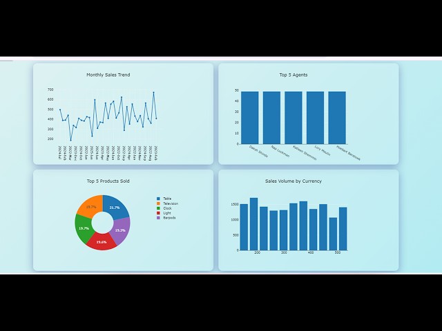
exceldashboardstutorial #excelskills #excelforbeginners Prompt 1 This is the structure of my sales data in JSON format.
481 views
1 year ago
NYC School of Data 2024 - March 23, 2024 09 Excel Power Query and Dashboards Anna Kelting - Analyst, NYC Parks Join us for ...
103 views
Funnel Chart Mastery: Step-by-Step Excel Guide | HowToLearnExcel Want to visualize data flow in a clear and structured way?
183 views
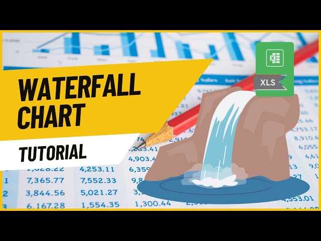
How to Create a Waterfall Chart in Excel (in Excel 2016 or newer) | How to Learn Excel In this video, we'll walk through creating a ...
1,682 views
Excel Charts 101: Best Practices for Clean and Effective Charts In this tutorial, you will learn: How to properly organize your data ...
304 views
Presented by Alisa Rod. This video is part of a series of lectures recorded to teach about basic data visualization concepts.
285 views
4 years ago
Struggling to separate numbers from text in Excel? Say goodbye to manual work and hello to automation with this powerful ...
18 views
10 months ago
NYC Open Data Week 2025 (March 23) This workshop introduces participants to data analysis in MS Excel using NYC Farmers' ...
75 views
9 months ago
Filter Closest Cells - Power Query Challenge 06 (Step-by-Step Tutorial) In this video, we'll show you a quick and easy way to filter ...
415 views
Mastering EXCEL Pivot Tables Quickly And Easily Excel Pivot Tables 101: From Raw Data to Actionable Insights Have you ever ...
4,948 views
This video covers basics of working with big data in excel including: Split Panes, GoTo, shift vs. control for selecting cells, and ...
3,116 views
11 years ago
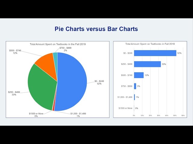
Stacked bar charts are an excellent option for displaying ordinal data and for highlighting part-to-whole relationships, like the ...
89,499 views
13 years ago
Raw dump is creating in better visualization which helps for better good business decision here is quick tip insert chart switch row ...
39 views
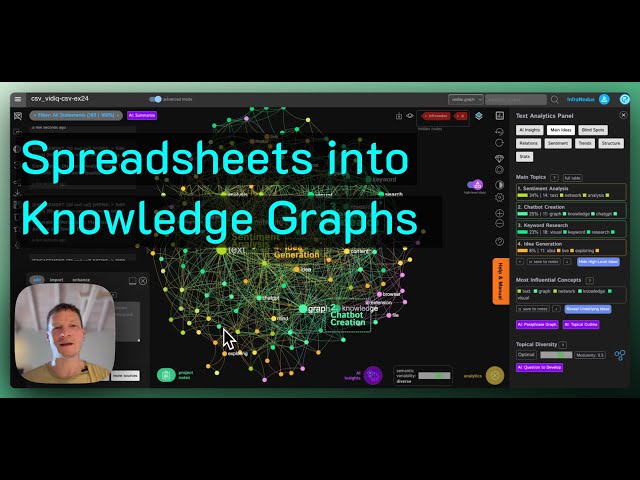
Using https://infranodus.com you can visualize the content of any CSV spreadsheet as a knowledge graph, so you can see the ...
2,423 views
Hello everyone! In todays video I want to show you how you can use Obsidian for data visualization by using Obsidian Charts, ...
24,679 views
2 years ago
Presented by David Christensen. This video is part of a series of lectures recorded to teach about basic data visualization ...
307 views
In this video, I'll show you how to adjust the units in your Excel chart's axes-- the long way and the *easy* way: 00:00 Intro 00:15 ...
159,685 views
12 years ago
Welcome test reporting quickly episode and this episode will be looking at data visualization so today's quickly will be sticking to ...
160 views
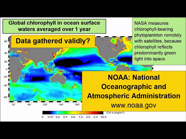
For an introductory college-level earth sciences class: a review of how to read and critically evaluate data visualizations such as ...
8,854 views
8 years ago
Learn how to save hours of manual work using Power Query to clean badly formatted data - usually encountered while copy ...
3,442 views
10 years ago
Multiple Header Rows: Power Query Data Transformation Guide In this tutorial, we dive into a common data ...
3,819 views
This video, part of the "Research & Assessment Cycle Toolkit," describes and demonstrates how to create charts and graphs using ...
625 views
3 years ago
Introduction to network analysis and visualization with GEPHI. Datasets and tutorial here: ...
108,823 views
This is the recording of the session conducted for Global Power Platform Bootcamp, Paris edition on 19th Feb 2021. Learn how to ...
1,809 views
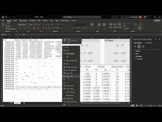
This video demonstrates how to create an R chart (range chart) in Microsoft Excel using the same dataset from the x-bar chart ...
12 views