Upload date
All time
Last hour
Today
This week
This month
This year
Type
All
Video
Channel
Playlist
Movie
Duration
Short (< 4 minutes)
Medium (4-20 minutes)
Long (> 20 minutes)
Sort by
Relevance
Rating
View count
Features
HD
Subtitles/CC
Creative Commons
3D
Live
4K
360°
VR180
HDR
71 results
An overview of the emergence, key moments, and examples from the history of data art, along with a presentation of selected ...
22 views
6 days ago
... IBM Data Analysis Specialization - https://coursera.pxf.io/AoYOdR Tableau Data Visualization - https://coursera.pxf.io/MXYqaN ...
4,673 views
7 days ago
That is exactly what accessibility in data visualization is. I don't rely on color alone. I don't hide meaning in tiny labels or clever ...
0 views
#DataAccessibility #AccessibleVisualizations #DataVisualization #InclusiveDesign #UXDesign #InformationDesign ...
558 views
4 hours ago
... math and mind-blowing data visualization. Discover: The difference between linear and exponential growth How compounding ...
4 views
1 day ago
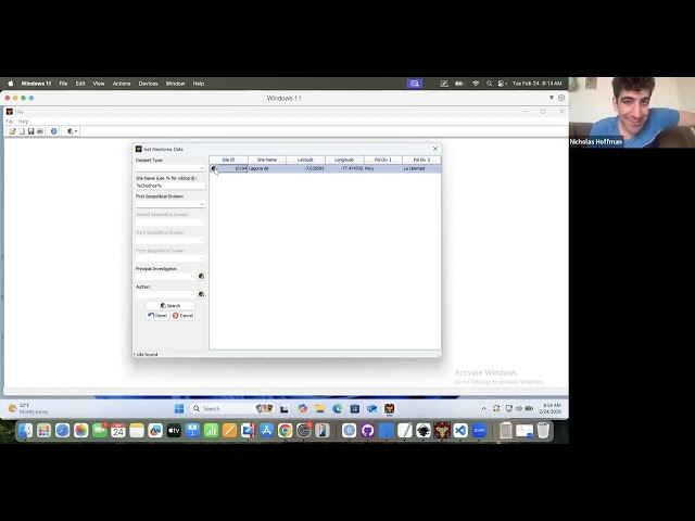
On February 24th, 2026, Nick Hoffman, data steward at the Neotoma Paleoecology Database, led a virtual workshop on using Eric ...
16 hours ago
Full course https://github.com/rmcelreath/stat_rethinking_2026.
1,085 views
4 days ago
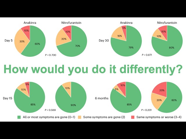
In this livestream, Pat refactors a set of pie charts from a paper recently published in Nature Microbiology. The figure panel ...
477 views
Streamed 6 days ago
Join Our FREE Power BI Demo Session! Are you looking to start your career in Power BI? This Power BI Free Demo Session is ...
3 days ago
... Data Analysis Specialization - https://coursera.pxf.io/AoYOdR Tableau Data Visualization - https://coursera.pxf.io/MXYqaN ...
0
When multiple injection molding systems within the same operation are connected through Advantage+Elite™, ...
90 views
Watch all 50 nations ranked by their official central bank gold reserves in this detailed data visualization. From massive vaults at ...
Which business analytics software should I use to analyze customer behavior? Discover the best business analytics software for ...
Watch how global inflation has evolved from 1960 to 2024 in this animated map. The video shows annual changes in consumer ...
1 view
5 days ago
Data Trail is an abstract 3D design exploring the invisible paths data leaves behind, movement, flow, layers, and digital energy ...
30 views
Data Analysis Using Power BI – Free Demo Session Welcome to the official Power BI Demo Class by Analytics Benchmark!
19 views
In the dark days of the COVID-19 lockdown, I ran a series of livestreams based on training workshops I'd previously delivered at ...
521 views
Streamed 1 hour ago
Animation showing Greenland icesheet mass losses between 2002 and 2025. Has superimposed ice sheet velocity streamlines.
21 views
reportingtool #react #datavisualization #javascript This video demonstrates how to set up the Report Designer in a React ...


![How to set up the Report Designer in a React application [2026]](/api/proxy/image?url=https%3A%2F%2Fi.ytimg.com%2Fvi%2FzeoXKTaIwRo%2Fsddefault.jpg)