Upload date
All time
Last hour
Today
This week
This month
This year
Type
All
Video
Channel
Playlist
Movie
Duration
Short (< 4 minutes)
Medium (4-20 minutes)
Long (> 20 minutes)
Sort by
Relevance
Rating
View count
Features
HD
Subtitles/CC
Creative Commons
3D
Live
4K
360°
VR180
HDR
225 results
Chapter 8: Media Visualizations. Play your favorite music with many types of Visualizations on the screen in Windows XP Media ...
848 views
3 weeks ago
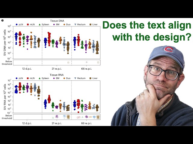
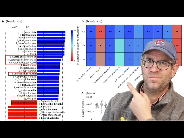
Pat critiques a figure from a paper published in the scientific journal Nature Microbiology that showed the response of the virus ...
578 views
Download : https://www.tableau.com/products/desktop-free/download My Courses on Linkedin Learning: ...
4,808 views
7 days ago
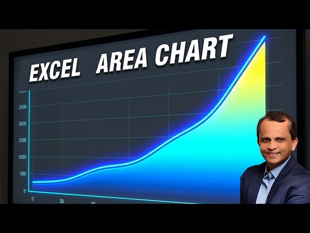
Like | Comment | Subscribe for more Excel & Data Visualization tutorials #Excel #ExcelCharts #DataVisualization #Analytics ...
9,637 views
1 month ago
8,050 views
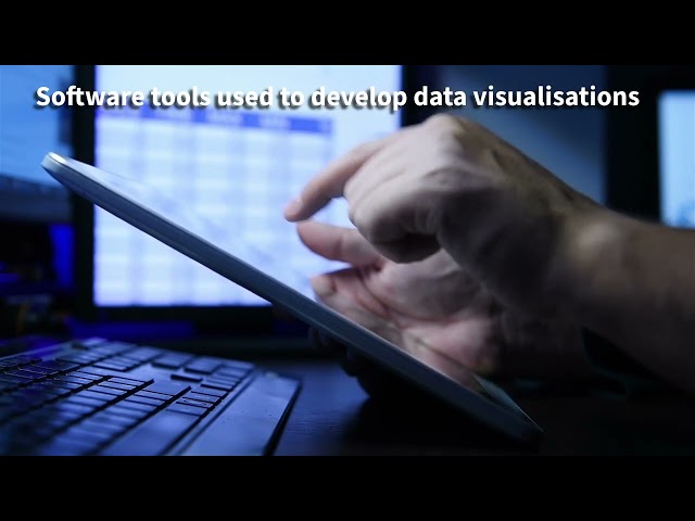
Overall, the effectiveness of data visualisation tools depends on the size, complexity and purpose of the enterprise data, with more ...
3 views
Conventional MPI trace visualizations become unwieldy as the number of processes increases. Identifying global patterns is ...
54 views
2 weeks ago
Boaz Leskes (https://www.linkedin.com/in/boazleskes/) MotherDuck (https://motherduck.com/) February 18, 2026 ...
1,647 views
Big data strongly affects the design and development of data visualisation because enterprises must manage very large, fast and ...
0 views
Welcome to Power BI Design Studio. This channel is dedicated to modern Power BI dashboard design, report layout strategy, and ...
4 days ago
Join Our FREE Power BI Demo Session! Are you looking to start your career in Power BI? This Power BI Free Demo Session is ...
25 views
11 days ago
... client reporting dashboard, operational dashboard, project management dashboard, data visualization software, dashboard tool ...
8 days ago
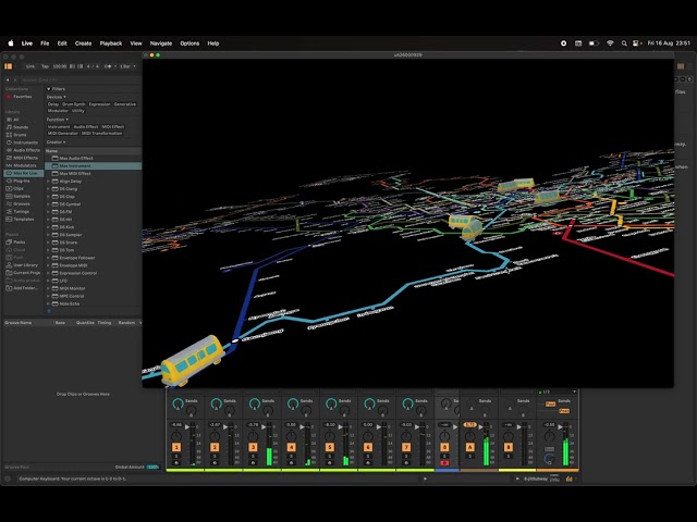
A test for using the subway map of Seoul as a graphic score using IanniX, Max MSP and Ableton Live.
38 views
Description of this work is available here: https://github.com/galaxyproject/galaxy/pull/21586.
49 views
In this livestream, Pat refactors a plot from a paper recently published in Nature Microbiology that had considerable room for ...
970 views
Streamed 1 month ago
In our first episode, Dan Chudnov and Ed Summers introduce themselves, get their bearings, and eventually look at a new ...
... IBM Data Analysis Specialization - https://coursera.pxf.io/AoYOdR Tableau Data Visualization - https://coursera.pxf.io/MXYqaN ...
5,354 views
At Evolving Web, we built a new visualization tool for GRID (Global Repository of Income Dynamics), an application that serves ...
17 views
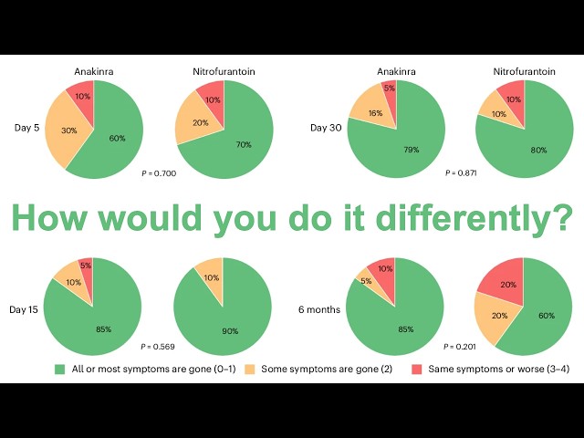
In this livestream, Pat refactors a set of pie charts from a paper recently published in Nature Microbiology. The figure panel ...
616 views
Streamed 2 weeks ago
How to Format your chart Axis in Tableau.
20 views
Music isn't just for your ears. When you compose with algorithms, you need to see the data. In this video, I introduce the "Visual ...
98 views
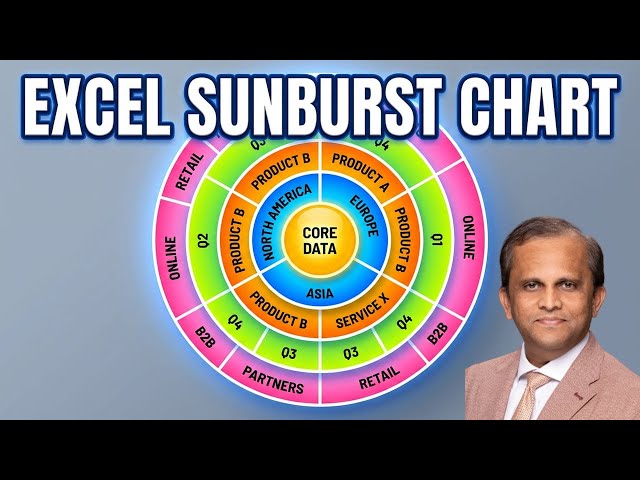
... Subscribe for more Excel & Data Visualization tutorials #Excel #SunburstChart #ExcelCharts #DataVisualization #ExcelTips
11,745 views
Numbers alone do not tell the story. Visualization turns data into insight. In this clip from Episode 20 of the INNOVATION Insights ...
8 views
Book A Call: https://calendly.com/agnes_bilik NotebookLM is no longer just a note-taking tool. With deep research, data tables, ...
360 views
On February 24th, 2026, Nick Hoffman, data steward at the Neotoma Paleoecology Database, led a virtual workshop on using Eric ...
64 views
9 days ago