Upload date
All time
Last hour
Today
This week
This month
This year
Type
All
Video
Channel
Playlist
Movie
Duration
Short (< 4 minutes)
Medium (4-20 minutes)
Long (> 20 minutes)
Sort by
Relevance
Rating
View count
Features
HD
Subtitles/CC
Creative Commons
3D
Live
4K
360°
VR180
HDR
400 results
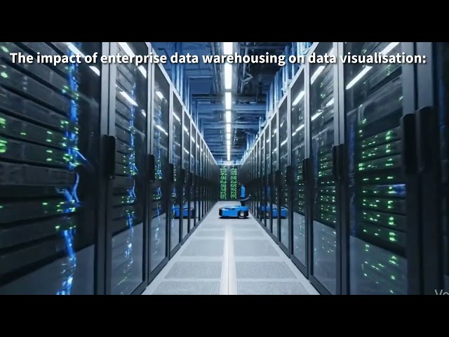
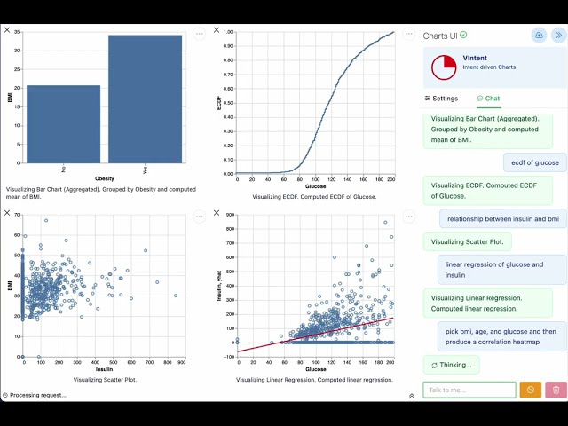
Enterprise data warehousing combined with Artificial Intelligence (AI) has a major impact on data visualisation because it allows ...
3 views
2 weeks ago
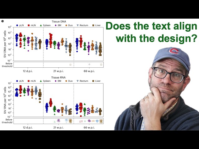
Pat critiques a figure from a paper published in the scientific journal Nature Microbiology that showed the response of the virus ...
553 views
In this livestream, Pat refactors a plot from a paper recently published in Nature Microbiology that had considerable room for ...
950 views
Streamed 2 weeks ago
Overall, the effectiveness of data visualisation tools depends on the size, complexity and purpose of the enterprise data, with more ...
In this livestream, Pat critiques a recent data visualization that was tweeted out by the White House and answered questions about ...
664 views
Streamed 3 weeks ago
Teaching material for Aalborg University's "Master i Datadrevet Organisationsudvikling".
23 views
1 month ago
Talk: Beautifully reproducible dataviz: lessons learnt from building data-to-viz pipelines Speaker: Cara Thompson.
34 views
3 weeks ago
Data Trail is an abstract 3D design exploring the invisible paths data leaves behind, movement, flow, layers, and digital energy ...
27 views
3 days ago
I'm joining Baraa on his channel to talk Data.
490 views
Streamed 12 days ago
User experience (UX) strongly influences the development of effective data visualisations because it focuses on how easily users ...
6 views
An overview of the emergence, key moments, and examples from the history of data art, along with a presentation of selected ...
20 views
5 days ago
Data Analysis And Visualization In Clojure Using Noj by Pekka Kaitaniemi in our first joint functional programming meetup of 2026 ...
26 views
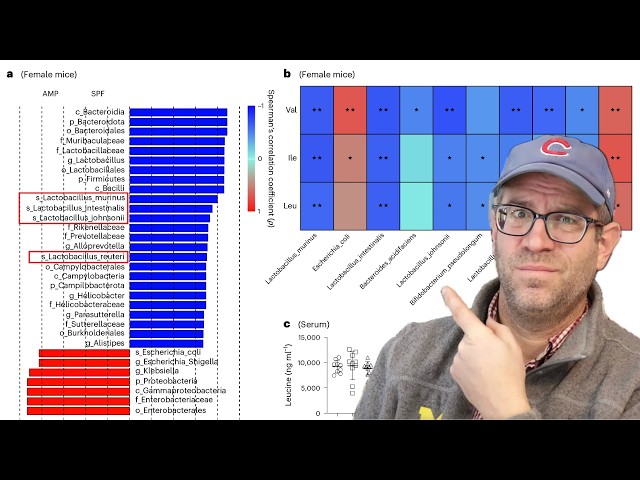
Big data strongly affects the design and development of data visualisation because enterprises must manage very large, fast and ...
0 views
Description of this work is available here: https://github.com/galaxyproject/galaxy/pull/21586.
42 views
11 days ago
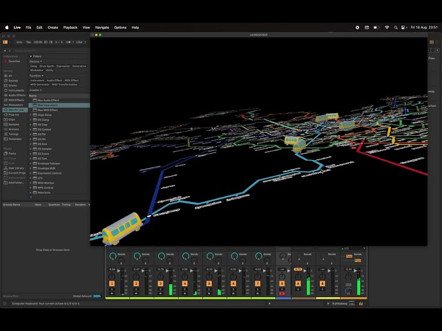
A test for using the subway map of Seoul as a graphic score using IanniX, Max MSP and Ableton Live.
38 views
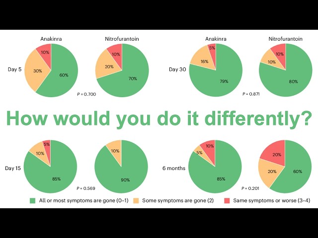
In this livestream, Pat refactors a set of pie charts from a paper recently published in Nature Microbiology. The figure panel ...
448 views
Streamed 5 days ago
Book A Call: https://calendly.com/agnes_bilik NotebookLM is no longer just a note-taking tool. With deep research, data tables, ...
345 views
10 days ago
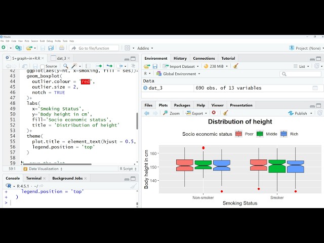
RStudio_Data_Visualization_in_R. If you need the code and dataset, please comment below. I will share them. You can also ...
7 days ago
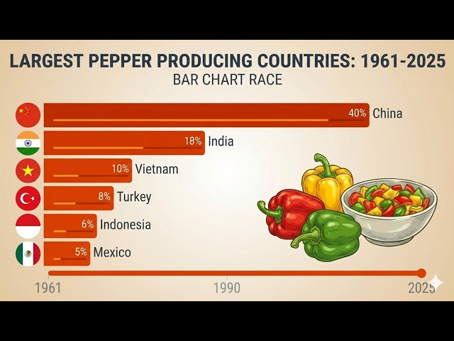
Hashtags: #DataVisualization #BarChartRace #Agriculture #PepperProduction #GlobalTrade #FoodStatistics #Top10 ...
204 views
So then we need to uh give the outlet file of our study area in our data sets input data sets first see here first see here. In our input ...
4 views