Upload date
All time
Last hour
Today
This week
This month
This year
Type
All
Video
Channel
Playlist
Movie
Duration
Short (< 4 minutes)
Medium (4-20 minutes)
Long (> 20 minutes)
Sort by
Relevance
Rating
View count
Features
HD
Subtitles/CC
Creative Commons
3D
Live
4K
360°
VR180
HDR
69 results
An overview of the emergence, key moments, and examples from the history of data art, along with a presentation of selected ...
19 views
4 days ago
#DataAccessibility #AccessibleVisualizations #DataVisualization #InclusiveDesign #UXDesign #InformationDesign ...
0 views
5 days ago
... Analyzing, Interpreting, and then Judging the visual he contends that we can give a more constructive data visualization that will ...
372 views
6 days ago
That is exactly what accessibility in data visualization is. I don't rely on color alone. I don't hide meaning in tiny labels or clever ...
Steam Deck is a successful console from Valve that runs on top of FOSS, having Linux as its operating system. For the regular ...
53 views
7 days ago
Conventional MPI trace visualizations become unwieldy as the number of processes increases. Identifying global patterns is ...
50 views
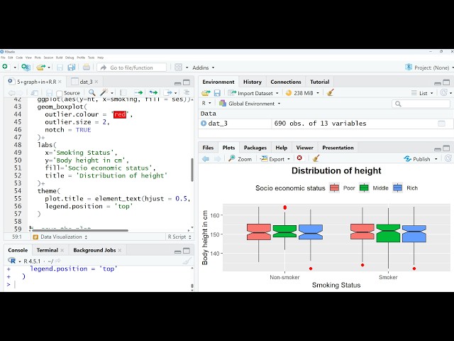
RStudio_Data_Visualization_in_R. If you need the code and dataset, please comment below. I will share them. You can also ...
Watch how global inflation has evolved from 1960 to 2024 in this animated map. The video shows annual changes in consumer ...
1 view
3 days ago
Join Our FREE Power BI Demo Session! Are you looking to start your career in Power BI? This Power BI Free Demo Session is ...
20 views
2 days ago
... IBM Data Analysis Specialization - https://coursera.pxf.io/AoYOdR Tableau Data Visualization - https://coursera.pxf.io/MXYqaN ...
4,407 views
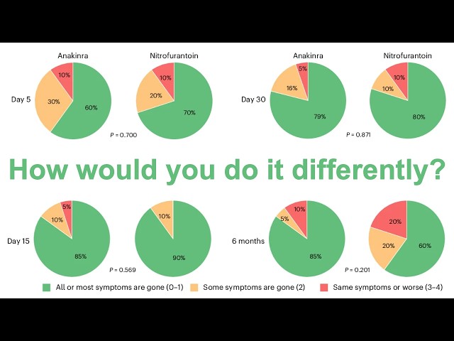
In this livestream, Pat refactors a set of pie charts from a paper recently published in Nature Microbiology. The figure panel ...
438 views
Streamed 4 days ago
Full course https://github.com/rmcelreath/stat_rethinking_2026.
939 views
In our first episode, Dan Chudnov and Ed Summers introduce themselves, get their bearings, and eventually look at a new ...
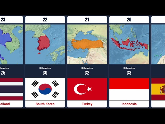
Watch all 50 countries ranked by their number of billionaire residents in this stunning data visualization. From global superpowers ...
14 views
Meet Luca Liebscht, researcher in the Data Analytics & Visualization Group, BSC-CNS at the Barcelona Supercomputing Center.
... become Graphic Designer Design Thinking Interaction Designer Data Visualization Chart Smartwatch Designer Design Mentor ...
43 views
1 day ago
Watch all 50 nations ranked by their official central bank gold reserves in this detailed data visualization. From massive vaults at ...
4 views
CSci 574 / AI 520: Machine Learning Live Stream Class Sessions East Texas A&M University.
27 views
Streamed 5 days ago
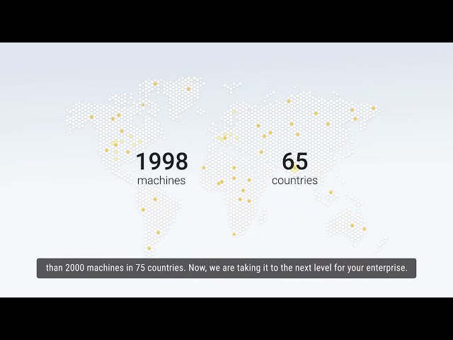
When multiple injection molding systems within the same operation are connected through Advantage+Elite™, ...
86 views
This Art Installation Will Overload Your Brain - Ryoji Ikeda Data-Verse Warning: Flashing Lights Ryoji Ikeda (born 1966, Gifu, ...
51 views
Animation showing Greenland icesheet mass losses between 2002 and 2025. Has superimposed ice sheet velocity streamlines.
In this session, we explore the intersection of mathematics and sound through Grandi's Rose (Rhodonea curves). By translating ...
17 views
Which business analytics software should I use to analyze customer behavior? Discover the best business analytics software for ...
SAP Analytics Cloud combines data visualization, business intelligence, and planning capabilities within a unified cloud platform ...
5 views
5 hours ago
Data Analysis Using Power BI – Free Demo Session Welcome to the official Power BI Demo Class by Analytics Benchmark!
16 views