Upload date
All time
Last hour
Today
This week
This month
This year
Type
All
Video
Channel
Playlist
Movie
Duration
Short (< 4 minutes)
Medium (4-20 minutes)
Long (> 20 minutes)
Sort by
Relevance
Rating
View count
Features
HD
Subtitles/CC
Creative Commons
3D
Live
4K
360°
VR180
HDR
1,437 results
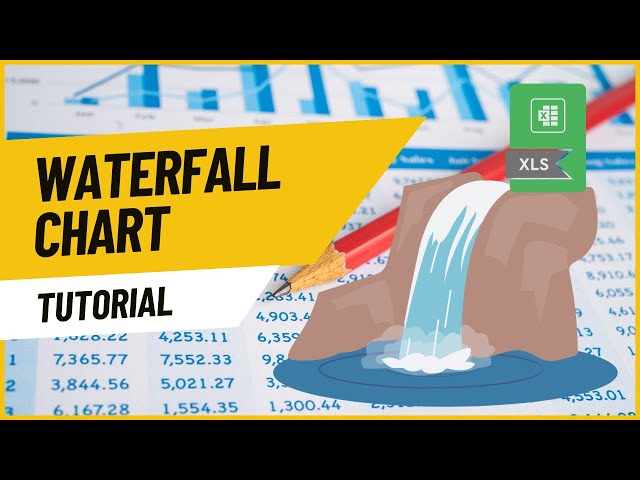
How to Create a Waterfall Chart in Excel (in Excel 2016 or newer) | How to Learn Excel In this video, we'll walk through creating a ...
1,696 views
1 year ago
This video covers basics of working with big data in excel including: Split Panes, GoTo, shift vs. control for selecting cells, and ...
3,123 views
11 years ago
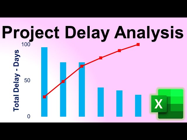
I use RODE: https://amzn.to/4nHhzmN Animate Project Delay Analysis in Excel! This video, explained by Dr. Mehrdad Arashpour, ...
1,219 views
11 months ago
Raw dump is creating in better visualization which helps for better good business decision here is quick tip insert chart switch row ...
39 views
4 years ago
I use Insta360: https://amzn.to/4mvNoxZ In this video of #engineeringmanagementacademy #pivottable is tutored in an ...
416 views
Excel Charts 101: Best Practices for Clean and Effective Charts In this tutorial, you will learn: How to properly organize your data ...
306 views
Conditional formatting shouldn't require a team of experts. With Smart XL, you can effortlessly: ✓ Create cell rules ✓ Add ...
155 views
This video, part of the "Research & Assessment Cycle Toolkit," describes and demonstrates how to create charts and graphs using ...
628 views
3 years ago
I use Insta360: https://amzn.to/4mvNoxZ In this video of #engineeringmanagementacademy #sparklines are tutored for ...
187 views
Presented by David Christensen. This video is part of a series of lectures recorded to teach about basic data visualization ...
310 views
exceldashboardstutorial #excelskills #excelforbeginners Prompt 1 This is the structure of my sales data in JSON format.
485 views
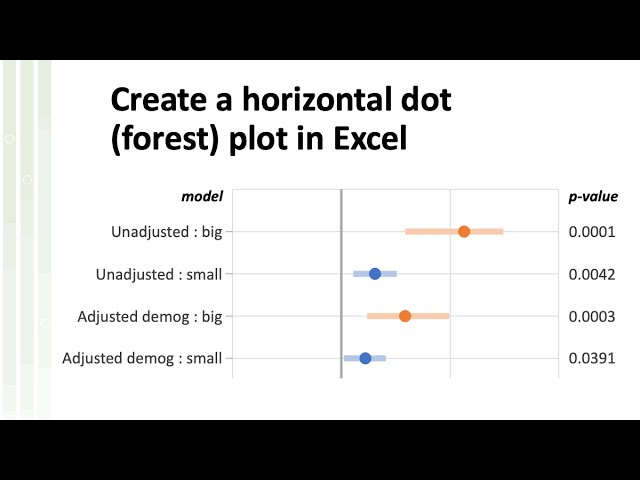
Horizontal bar charts are one of the Excel default plots, but what if you need the same arragement, but with symbols instead of ...
8,999 views
2 years ago
This video is perfect for aspiring data analysts, BI developers, and anyone looking to improve their data visualization skills.
170 views
In this 1 hour Webinar, Dr. Nitin Paranjape (Office MVP) will show you how to structure and analyze large amount of data in just a ...
17,355 views
10 years ago
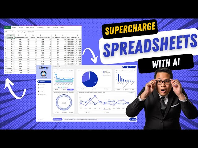
Analyse and visualise your data in spreadsheets using natural language english with Clevrr Sheets. Create beautiful dashboards ...
112 views
Funnel Chart Mastery: Step-by-Step Excel Guide | HowToLearnExcel Want to visualize data flow in a clear and structured way?
188 views
NYC Open Data Week 2025 (March 23) This workshop introduces participants to data analysis in MS Excel using NYC Farmers' ...
79 views
9 months ago
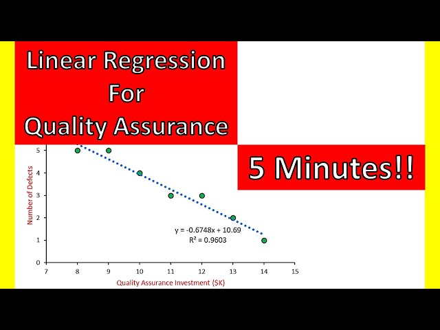
I use iPhone 17 pro max→ https://amzn.to/3Vr1BB6 In this video of #engineeringmanagementacademy #LinearRegression is ...
561 views
This is the recording of the session conducted for Global Power Platform Bootcamp, Paris edition on 19th Feb 2021. Learn how to ...
1,811 views
My Courses on Linkedin Learning: https://www.linkedin.com/learning/instructors/tim-ngwena Boost your skills with DataCamp's ...
7,355 views