Upload date
All time
Last hour
Today
This week
This month
This year
Type
All
Video
Channel
Playlist
Movie
Duration
Short (< 4 minutes)
Medium (4-20 minutes)
Long (> 20 minutes)
Sort by
Relevance
Rating
View count
Features
HD
Subtitles/CC
Creative Commons
3D
Live
4K
360°
VR180
HDR
10 results
Subscribe for more Excel tips, data visualization tutorials, and design guides. Channel: DESIGN ZONE 1.0 #Excel #Histogram ...
0 views
7 minutes ago
ArcGIS #Shapefile #KML #KMZ #GIS #MappingTutorial #GeospatialAnalysis Buy me a coffee here: ...
8 minutes ago
planning example. In this step-by-step Excel tutorial, you'll build a professional timeline dashboard that helps you track milestones ...
With Filmora Relight Features Get Professional Lighting WITHOUT Studio Gear! Master this skill today and instantly upgrade the ...
14 minutes ago
Since 2015, Content Catalyst has been empowering students, researchers, and professionals with smart, customized solutions ...
53 minutes ago
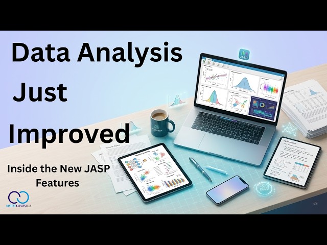
... #DataScience #DataVisualization #HealthIT #PharmaData #ClinicalTrialsManagement #DataAnalysisTools #PharmaAnalytics ...
35 minutes ago
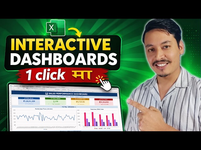
Excel मा dashboard बनाउने काम धेरैजसो office professionals, data analysts, र Excel learners का लागि ...
18 views
38 minutes ago
In this beginner-friendly Python tutorial, you will learn how to plot a graph in Python using the Matplotlib library. Matplotlib is one of ...
... #ExcelVBA #VBATutorial #MacroExcel #PythonForExcel #PythonProgramming #PowerBI #DataVisualization #ExcelTraining ...
25 minutes ago
Power BI Full Course in Hindi — In this step-by-step Class 3, you will learn ETL concepts, Power Query Building Blocks, and M ...