ViewTube

ViewTube
Sign inSign upSubscriptions
Filters

Upload date

Type

Duration

Sort by

Features

Reset

120 results

LEARN WITH DESIRE
Data visualization using matplotlib library (pie,line,bar,scatter) charts

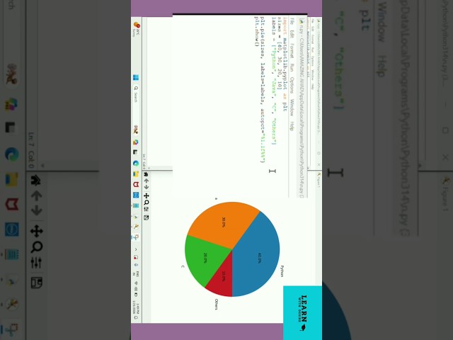
Visualize data using Matplotlib. #matplotlib #python #shorts.

2:51
Data visualization using matplotlib library (pie,line,bar,scatter) charts

18 views

14 hours ago

Design Zone 1.0
How to Make a 3D Histogram in Excel

Subscribe for more Excel tips, data visualization tutorials, and design guides. Channel: DESIGN ZONE 1.0 #Excel #Histogram ...

1:28
How to Make a 3D Histogram in Excel

0 views

7 hours ago

Intellipaat
Data Science Full Course 2026 | Learn Data science For Free | Intellipaat

The program covers key concepts such as Python programming, statistics, machine learning, data visualization, and SQL, helping ...

10:58:31
Data Science Full Course 2026 | Learn Data science For Free | Intellipaat

8,548 views

Streamed 3 hours ago

INDUSTRIAL AUTOMATION MAVEN --- LOUIS WYN
Industrial IoT: Schneider PLC + Node-RED Dashboard 📊

Learn how to connect Schneider Control Expert to Node-RED Dashboards using Modbus TCP for real-time IIoT data visualization.

0:51
Industrial IoT: Schneider PLC + Node-RED Dashboard 📊

24 views

16 hours ago

Microsoft Security
Explore and analyze lake data with Jupyter Notebooks

Use Jupyter Notebooks to query, enrich and create visualizations directly within the notebook environment. To learn more about ...

6:17
Explore and analyze lake data with Jupyter Notebooks

47 views

1 day ago

VirtuallyVisual
How to make abstract sci-fi data visuals in C4D! #cinema4d #3dtutorial #redshift

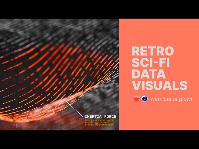
Friends - let's dive in today on making some satisfying data visuals with an added retro glow. Feeling very tron-esque in my ...

30:15
How to make abstract sci-fi data visuals in C4D! #cinema4d #3dtutorial #redshift

16 views

23 minutes ago

The Power BI with Sudhir
Why Power BI Still Matters in the Age of AI (Don’t Ignore This in 2026)

... dashboard power bi performance tracking dashboard power bi visualization tutorial employee engagement dashboard power bi ...

10:56
Why Power BI Still Matters in the Age of AI (Don’t Ignore This in 2026)

16 views

6 hours ago

Intellipaat
Learn Data Science From Basics | Data Science For Beginners | Intellipaat

The program covers key concepts such as Python programming, statistics, machine learning, data visualization, and SQL, helping ...

10:58:05
Learn Data Science From Basics | Data Science For Beginners | Intellipaat

1,487 views

6 hours ago

Webkul
How Does Odoo Tableau Connector Help You Visualize and Analyze Business Data?

... #odooerp #tableau #datavisualization #businessanalytics #odootips #businessintelligence #dataintegration #odooautomation ...

5:03
How Does Odoo Tableau Connector Help You Visualize and Analyze Business Data?

14 views

13 hours ago

Data Viz Canvas
Tableau Field Dependencies Visualized in 10 Seconds (Free Tool)

... DATA VISUALISATION & STORYTELLING Storytelling with Data: A Data Visualisation Guide for Business Professionals ...

9:46
Tableau Field Dependencies Visualized in 10 Seconds (Free Tool)

0 views

7 hours ago

Taylor Sparks
From Plot to Data: How Close Are AI Models to Reading Science Like Humans?

Can large language models really extract quantitative data from scientific figures? In this Materials Minute, we explore our new ...

6:08
From Plot to Data: How Close Are AI Models to Reading Science Like Humans?

223 views

14 hours ago

Geojay GIS Solution
Convert Shapefile To kml or kmz Tutorial

ArcGIS #Shapefile #KML #KMZ #GIS #MappingTutorial #GeospatialAnalysis Buy me a coffee here: ...

0:23
Convert Shapefile To kml or kmz Tutorial

0 views

7 hours ago

Analytics with Nags
Power BI DAX - USERELATIONSHIP - RELATED Functions - Power BI Complete Course 2026 - C6.8

... #powerbitutorial #analytics #businessintelligence #dataanalysis #dataanalytics #datavisualization #datawarehouse #analytics ...

12:13
Power BI DAX - USERELATIONSHIP - RELATED Functions - Power BI Complete Course 2026 - C6.8

207 views

17 hours ago

BlueSky Citadel
INTRODUCTION TO TABLEAU 01OCT25

In this video: ➖ ➖ ➖ ➖ ➖ ➖ ➖ ➖ ➖ ➖ ➖ ➖ ➖ ➖ ➖ ➖ ➖ ➖ ➖ ➖ ➖ ➖ ➖ ➖ BlueSky Citadel is a premier educational ...

1:13:05
INTRODUCTION TO TABLEAU 01OCT25

41 views

21 hours ago

UK DATA SERVICE
Mapping crime data in R: Interactive introduction

Unlock the Power of Crime Mapping in R Do you want to turn raw crime data into powerful, visual insights? This workshop will ...

1:39:25
Mapping crime data in R: Interactive introduction

183 views

Streamed 1 day ago

ServiceNow Community
Platform Analytics "Australia Default Experience - March 4th, 2026 - Platform Analytics Academy

On March 4th, 2026, we hosted a Platform Analytics Academy session exploring the changes to Platform Analytics following the ...

59:21
Platform Analytics "Australia Default Experience - March 4th, 2026 - Platform Analytics Academy

159 views

22 hours ago

Geojay GIS Solution
ArcGIS Layer Transparency Management Tutorial Review now

ArcGIS #LayerTransparency #GIS #MappingTutorial #DataVisualization #SpatialAnalysis #GeographicInformationSystems Buy ...

0:41
ArcGIS Layer Transparency Management Tutorial Review now

0 views

18 hours ago

Trimble Geospatial
Trimble Connect multi-pane viewer | Pane layout tab

Watch this overview to learn how you can tailor the viewing environment within the Trimble Connect multi-pane viewer to your ...

0:44
Trimble Connect multi-pane viewer | Pane layout tab

60 views

1 day ago

HelloPapri
How to Connect Data Source in Power BI | Excel to Power BI Step by Step Bangla

In this video, you will learn how to connect a data source in Power BI. Data connection is the first and most important step in Power ...

1:57
How to Connect Data Source in Power BI | Excel to Power BI Step by Step Bangla

5 views

5 hours ago

Dr.Manisha More
Tesla Stock Data Analysis and Forecasting using Power BI | End-to-End Power BI Project

drmanishamore Download Dataset from ...

1:19:02
Tesla Stock Data Analysis and Forecasting using Power BI | End-to-End Power BI Project

19 views

6 hours ago

Imran Latif
Master Pandas in Python – The Ultimate Beginner to Advanced Tutorial #pandasformachinelearning

Learn everything you need to know about the Pandas Python library in this complete, hands-on tutorial! Whether you're a ...

30:00
Master Pandas in Python – The Ultimate Beginner to Advanced Tutorial #pandasformachinelearning

65 views

10 hours ago

Entrepreneurship TV
Data Analysis with Excel: ANALYSIS & VISUALIZATION

Data Analysis with Excel: Analysis & Visualization Discover how to turn raw data into meaningful insights using **Microsoft Excel** ...

24:50
Data Analysis with Excel: ANALYSIS & VISUALIZATION

9 views

21 hours ago

Vanga Therinjikalam
CS3361 FODSP Experiment 7 || Visualizing Geographic Data using Basemap in Python

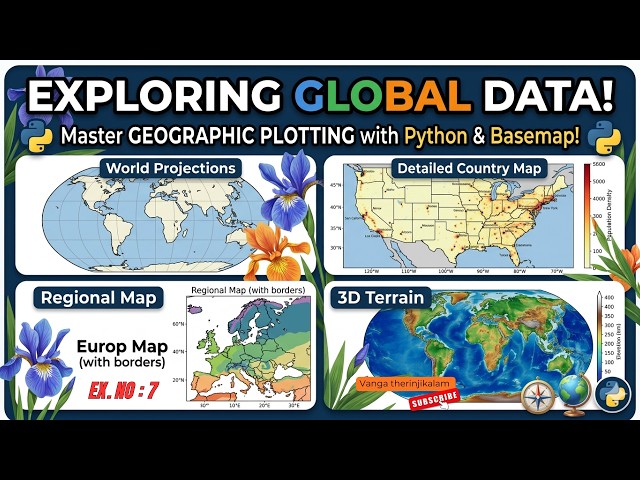
This experiment is useful for Anna University CS3361 Data Science Lab students learning geographic data visualization ...

1:01
CS3361 FODSP Experiment 7 || Visualizing Geographic Data using Basemap in Python

0 views

9 hours ago

Geojay GIS Solution
Countries Shapefile Download In Global Mapper Tutorial

GlobalMapper #Shapefile #GeospatialData #MappingTutorial #GIS #CountryBoundaries #DataDownload Buy me a coffee here: ...

0:18
Countries Shapefile Download In Global Mapper Tutorial

0 views

3 hours ago

aicuflow
Area and Line Chart | Beautiful Plots & Dashboards with aicuflow

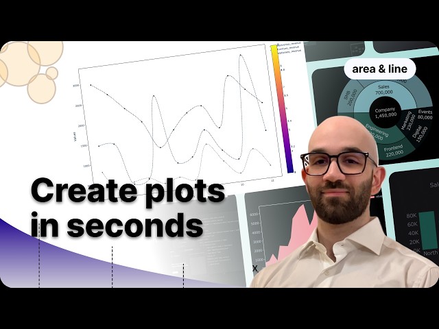
Learn how to visualize your time-series data by creating a custom Area and Line plot with aicuflow. In this step-by-step tutorial, we ...

1:52
Area and Line Chart | Beautiful Plots & Dashboards with aicuflow

12 views

14 hours ago