ViewTube

ViewTube
Sign inSign upSubscriptions
Filters

Upload date

Type

Duration

Sort by

Features

Reset

124 results

Code with Bibek
PL 300 Exam Q&A #10 - Power BI Data Analyst Associate

Prepare for the PL-300 exam with this set of Microsoft Power BI Data Analyst Q&A! Test your knowledge with real exam-style ...

21:56
PL 300 Exam Q&A #10 - Power BI Data Analyst Associate

4 views

2 days ago

Microlearning Daily
Understanding Clinical Data Analysis and Its Importance (16 Minutes)

In this video, we explore "Understanding Clinical Data Analysis: A Comprehensive Overview." Clinical data analysis is a crucial ...

15:16
Understanding Clinical Data Analysis and Its Importance (16 Minutes)

0 views

1 day ago

Learn Microsoft Fabric with Will
Using Claude & BMAD to elicit Microsoft Fabric project requirements

Learn Fabric AI workflows: https://skool.com/fabricai/about Learn Fabric Data Engineering: https://skool.com/fabricdojo/about ...

1:24:18
Using Claude & BMAD to elicit Microsoft Fabric project requirements

176 views

2 hours ago

Susan B.
R Project Structure - Best Practices

A clean, consistent project structure is one of the most powerful workflow improvements you can make in R. In this video, I walk ...

6:09
R Project Structure - Best Practices

119 views

6 days ago

Don't Use This Code • James Powell
Exploring Data Visualization with HoloViz | The Python Exchange February 2026

About the Python Exchange for the Department of Energy: https://meetup.doepy.org/ Sign up here to be notified when the next ...

53:02
Exploring Data Visualization with HoloViz | The Python Exchange February 2026

35 views

1 day ago

Simplilearn
Seaborn Tutorial For Beginners 2026 | Seaborn Library In Python | Seaborn Explained | Simplilearn

Data Analyst Masters Program (Discount Code - YTBE15) ...

21:43
Seaborn Tutorial For Beginners 2026 | Seaborn Library In Python | Seaborn Explained | Simplilearn

282 views

4 hours ago

PyData
Mike Woodward - Building with Cursor Part 1 (PyData Boston)

www.pydata.org PyData is an educational program of NumFOCUS, a 501(c)3 non-profit organization in the United States. PyData ...

50:51
Mike Woodward - Building with Cursor Part 1 (PyData Boston)

490 views

7 days ago

Big Data & Analytics
Data Visualization: Bridging the Gap: Transforming Complex Data Insights into Business Narratives

Data Visualization, Bridging the Gap, Transforming Complex Data Insights into Business Narratives Big Data & Analytics Summit ...

30:53
Data Visualization: Bridging the Gap: Transforming Complex Data Insights into Business Narratives

5 views

6 days ago

The Explainer Office
How do you run a pilot of data visualization software in 14 days (practical plan)?

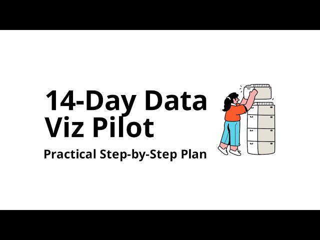
How do you run a pilot of data visualization software in 14 days (practical plan)? Learn how to run a data visualization software ...

12:22
How do you run a pilot of data visualization software in 14 days (practical plan)?

0 views

14 hours ago

Micah Johnson
This AI Just Replaced My Entire Data Analysis Workflow

... data sources, such as podcast analytics • Converting raw data into visual presentations • Best practices for data visualization in ...

12:09
This AI Just Replaced My Entire Data Analysis Workflow

41 views

2 days ago

BI Consulting Pro
BI Consulting Pro | Explore the World of Data & AI #biconsultingpro #data #ai

Join this channel to get access to perks: https://www.youtube.com/channel/UC58wkmi2AsxrFt3BAT77cPA/join BI Consulting Pro is ...

1:04
BI Consulting Pro | Explore the World of Data & AI #biconsultingpro #data #ai

84 views

3 days ago

AmericaTech, Inc.
Power BI for Beginners | Turn Excel Data into Interactive Reports | America Tech || Episode 2

Welcome back to another episode of America Tech! In this tutorial, you will learn how to move from Excel to Power BI and build ...

2:09
Power BI for Beginners | Turn Excel Data into Interactive Reports | America Tech || Episode 2

78 views

6 days ago

Plotivy
Publication-Ready Python Figures from Your Browser in Minutes

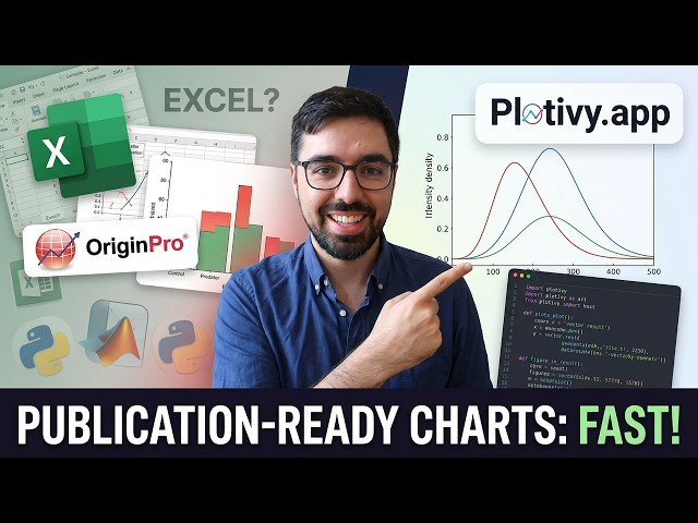
RELATED RESOURCES • Plotivy blog — data visualization best practices for researchers: https://plotivy.app/blog • Chart types ...

16:26
Publication-Ready Python Figures from Your Browser in Minutes

8 views

4 days ago

GritAI Studio
How to Add Interactive UIs in Claude and ChatGPT via MCP Apps

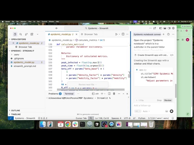
MCP Apps let your tools render interactive dashboards, forms, and visualizations directly inside Claude and ChatGPT. In this ...

14:38
How to Add Interactive UIs in Claude and ChatGPT via MCP Apps

6,180 views

4 days ago

GBG Analytics
Visualising Uncertainty in Data: How to Show What Your Data Doesn't Know

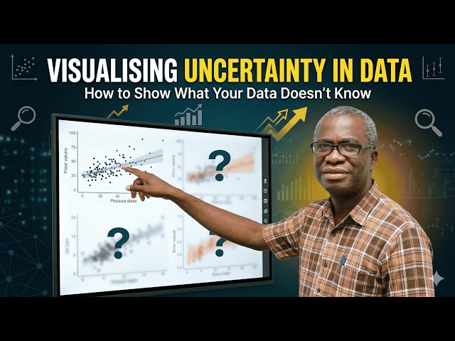
UNILORIN R Users Group Workshop Series: Visualising Uncertainty in Data: How to Show What Your Data Doesn't Know* ...

Upcoming
Visualising Uncertainty in Data: How to Show What Your Data Doesn't Know

0 views

0

Single Cell Immunophenotyping Core
Illumina Single-Cell RNA Prep: Full Workflow & Data Analysis Guide

Join the University of Chicago SCIC (scic.pme.uchicago.edu) for an in-depth technical workshop on the Illumina Single Cell 3' ...

48:27
Illumina Single-Cell RNA Prep: Full Workflow & Data Analysis Guide

8 views

2 hours ago

WGU PREP
D466 Analyzing and Visualizing Data Practice Questions

D466 Analyzing and Visualizing Data – Mastering Data Insights and Visualization This video covers key concepts from D466 ...

6:44
D466 Analyzing and Visualizing Data Practice Questions

0 views

5 days ago

KnowHow
How to Add Axis Titles in Excel Charts | Make Charts Clear & Professional

In this video, you will learn how to add axis titles in Excel charts to make your data easier to understand and more professional.

2:27
How to Add Axis Titles in Excel Charts | Make Charts Clear & Professional

0 views

5 hours ago

Code with Bibek
PL 300 Exam Q&A #8 - Power BI Data Analyst Associate

Prepare for the PL-300 exam with this set of Microsoft Power BI Data Analyst Q&A! Test your knowledge with real exam-style ...

19:58
PL 300 Exam Q&A #8 - Power BI Data Analyst Associate

20 views

7 days ago

Gibson D. Lewis Health Science Library
Conference Ready: Vital Signs for Better Data Visuals

Check the pulse of your data visualizations in this beginner-friendly workshop! Learn how to tell your data story with graphical ...

39:49
Conference Ready: Vital Signs for Better Data Visuals

7 views

6 days ago