Upload date
All time
Last hour
Today
This week
This month
This year
Type
All
Video
Channel
Playlist
Movie
Duration
Short (< 4 minutes)
Medium (4-20 minutes)
Long (> 20 minutes)
Sort by
Relevance
Rating
View count
Features
HD
Subtitles/CC
Creative Commons
3D
Live
4K
360°
VR180
HDR
190,720 results
... Histogram 02:24 Bar Chart 03:58 Stacked Bar Chart 05:45 Line Chart 06:49 Scatter Plot 07:39 Bonus Charts #datavisualization ...
160 views
6 days ago
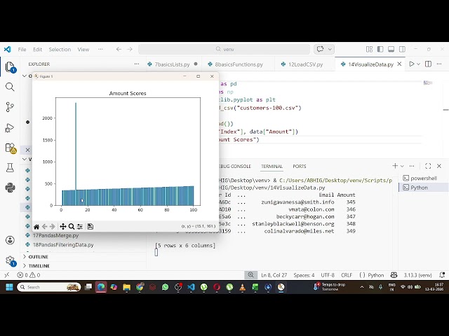
Learn how to create advanced Pie Charts, Histograms, and Subplots in Python using the Matplotlib library in this beginner-friendly ...
0 views
3 days ago
Join my Academy, learn Data & AI skills and land a job https://analyticsautomation.academy/ This video teaches a full Python ...
37,019 views
11 days ago
Learn how to sort and reorganize objects in Blender using Geometry Nodes based on any numerical value or attribute. In this ...
3,120 views
2 weeks ago
Most people misunderstand data visualization jobs. When you hear “data visualization,” you probably think dashboards, charts, ...
77 views
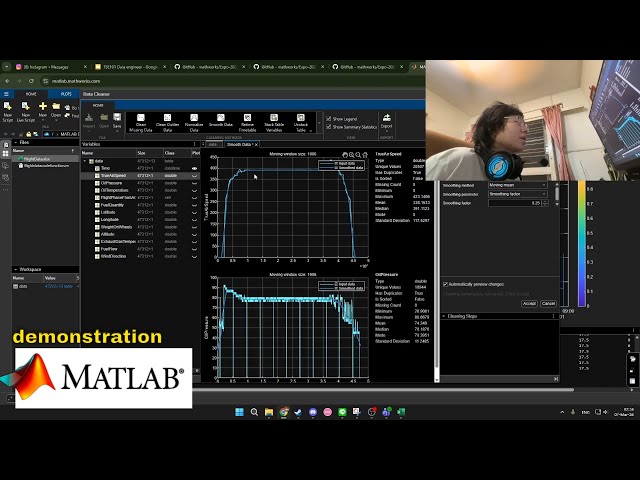
Hello and welcome to the demonstration of the MATLAB program that we are going to be using for data cleaning and visualization ...
23 views
8 days ago
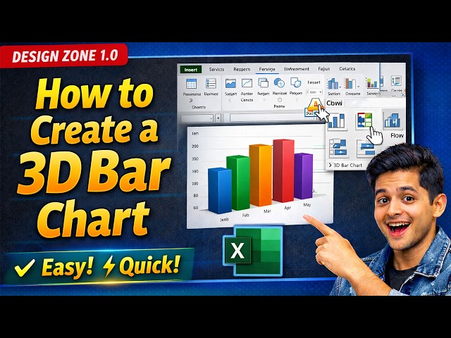
Learn how to create a 3D bar chart in Excel quickly and professionally in this step-by-step tutorial. In this video, you will discover ...
5 days ago
In Part 3 of this Data Visualization with Python Course 2026, you will create categorical, advanced statistical, and geospatial ...
94 views
3 weeks ago
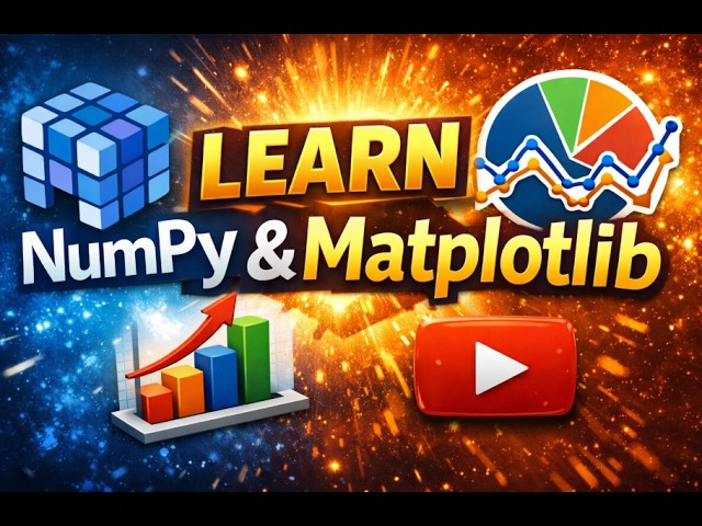
Master NumPy & Matplotlib in One Video | Full Beginner Tutorial Now here's a powerful YouTube description you can copy: In ...
64 views
In Part 2 of this Data Visualization with Python Course 2026, you will learn how to visualize data distributions, relationships, and ...
123 views
1 month ago
Claude now creates diagrams, interactive tools, and visualizations right in the conversation. Follow a student from choosing a ...
325,294 views
2 days ago
Microsoft Power BI is a powerful business intelligence (BI) and data visualization tool developed by Microsoft. It allows users to ...
7 days ago
In Part 4 of this Data Visualization with Python Course 2026, you will learn how to customize and style charts for clarity, readability, ...
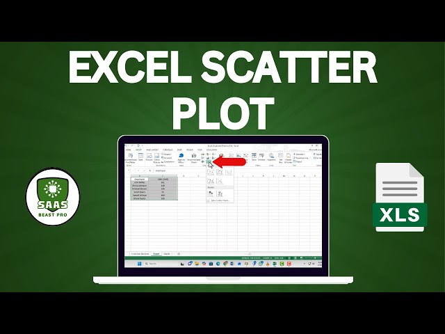
️⃣ #ExcelTutorial #DataVisualization #ScatterPlot Learn how to draw a scatter diagram in Excel to visualize relationships ...
8 views
Welcome to the Looker Tutorial. This comprehensive Looker Course is designed to take you from a complete beginner to a data ...
248 views
Ready to build your first interactive dashboard? In this tutorial, I'll show you how to go from raw data to a stunning, modern ...
32 views
12 days ago
This recorded workshop from UC Love Data Week 2026 will introduce you to the transformative potential of AI-assisted data ...
87 views
In this video, we explain how to use Matplotlib for Data Visualization in Python. Topics Covered: What is Matplotlib? Creating Line ...
2 views
On February 24th, 2026, Nick Hoffman, data steward at the Neotoma Paleoecology Database, led a virtual workshop on using Eric ...
66 views
0


![Data Visualization with Python Course [2026] - Part 3: Categorical, Statistical & Geospatial Charts](/api/proxy/image?url=https%3A%2F%2Fi.ytimg.com%2Fvi%2FR4mnsA5dctU%2Fsddefault.jpg)
![Data Visualization with Python Course [2026] - Part 2: Distribution & Time Series Charts](/api/proxy/image?url=https%3A%2F%2Fi.ytimg.com%2Fvi%2Ftaa64u_CcYk%2Fsddefault.jpg)


![Data Visualization with Python Course [2026] - Part 4: Chart Customization & Styling](/api/proxy/image?url=https%3A%2F%2Fi.ytimg.com%2Fvi%2FQy26YmM9KTg%2Fsddefault.jpg)