Upload date
All time
Last hour
Today
This week
This month
This year
Type
All
Video
Channel
Playlist
Movie
Duration
Short (< 4 minutes)
Medium (4-20 minutes)
Long (> 20 minutes)
Sort by
Relevance
Rating
View count
Features
HD
Subtitles/CC
Creative Commons
3D
Live
4K
360°
VR180
HDR
164 results
WANT TO BECOME A DATA ANALYST USING TABLEAU? Join 100000+ students learning real-world analytics skills (not theory).
0 views
4 hours ago
If you like Excel tips and data visualization tutorials, don't forget to Like , Comment and Subscribe for more Excel tricks.
2 hours ago
In this video, you will learn how to add axis titles in Excel charts to make your data easier to understand and more professional.
49 minutes ago
... you how visual content marketing and chatgpt infographics can generate dynamic social media posts with data visualization ai.
2 views
23 hours ago
Variance Column Bar Chart in Excel Learn how to create a Variance Column Bar Chart in Excel to compare Target vs Sales ...
20 hours ago
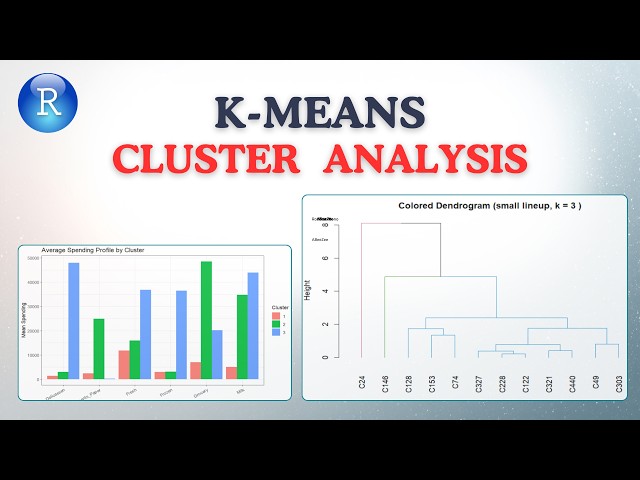
K-means is everywhere in data science, but most people choose k the wrong way. In this AGRON Info Tech tutorial, we use a real ...
14 views
1 day ago
Data Analyst Masters Program (Discount - YTBE15) ...
793 views
Streamed 17 hours ago
861 views
Image Credit: Café Wall Illusion Originally described by Richard Gregory in 1979. Image sourced from Wikimedia Commons.
5 views
ArcGIS #LayerTransparency #GIS #MappingTutorial #DataVisualization #SpatialAnalysis #GeographicInformationSystems Buy ...
11 hours ago
... learn data science python python for data analysis python pandas tutorial numpy python tutorial python data visualization data ...
11 views
8 hours ago
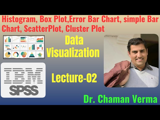
You will learn how to create different types of charts in SPSS including Histogram, Box Plot, Error Bar Chart, Bar Charts (one ...
19 views
19 hours ago
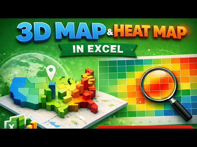
3D Map & Heat Map in Excel | Data Visualization Tutorial | DU Sem V | Do like, share, comment and subscribe the channel In this ...
6 views
12 hours ago
How to create a Column Chart in Power BI • How to create a Clustered Column Chart in Power BI • The difference between ...
4 views
Power BI Made Simple Playlist ...
21 hours ago
Excel, SQL & Power BI Project for Data Analysts | Pharmacy Openings and Closures End-to-End Tutorial All links 5. Pharmacy ...
54 views
22 hours ago
Want to learn Power BI fast? Start with this beginner-friendly tutorial where you'll import data, clean it, build your first interactive ...
32 views
Data Visualization – Using Matplotlib, Seaborn, and Plotly to create impactful charts and dashboards. Power BI & Tableau ...
29 views
Georeferencing #MapTutorial #GIS #Cartography #MapMaking #SpatialAnalysis #MappingSkills Buy me a coffee here: ...
Master quantitative cyber risk modeling with this interactive ransomware bow tie chart built in Python using Plotly. Prof. Hernan ...