ViewTube

ViewTube
Sign inSign upSubscriptions
Filters

Upload date

Type

Duration

Sort by

Features

Reset

3,184 results

Excel Tricks Tips
How to create Dashboards in excel || Data Visualization in excel #exceltutorial #exceltips

excelmis #exceltutorial #MIS MS Excel Excel Inertview questions and answers MS excel full course in hindi MS excel full course ...

9:52
How to create Dashboards in excel || Data Visualization in excel #exceltutorial #exceltips

31 views

11 days ago

Full Course
Excel Data Analysis & Visualization 2026: The Complete Masterclass | Complete Excel Data Analysis

Stay Connected: Subscribe Now & Start Your Web Development Journey Today!

4:24:03
Excel Data Analysis & Visualization 2026: The Complete Masterclass | Complete Excel Data Analysis

186 views

3 days ago

TechEdge Wave
✅ From Raw Data to Executive Dashboard in 20 Minutes (Excel Only) 📊

This Excel-only dashboard tutorial for US users (2026) shows how to turn raw data into a clean executive dashboard in under 20 ...

12:42
✅ From Raw Data to Executive Dashboard in 20 Minutes (Excel Only) 📊

16 views

3 weeks ago

Data Driven Path
Excel Dashboard Design for Data Visualization | Complete Guide

Learn how to design a professional Excel dashboard that transforms raw data into clear, insightful, and visually stunning data ...

45:43
Excel Dashboard Design for Data Visualization | Complete Guide

19 views

13 days ago

NASIG
Excel Mastery: Effective Data Visualization and Trend Analysis for Database Renewals Assessment

Having visualizations to quickly intake various inter-related data points can help with decision-making and communicating value ...

38:22
Excel Mastery: Effective Data Visualization and Trend Analysis for Database Renewals Assessment

183 views

12 days ago

My Data Projects
Full Excel Data Analysis Portfolio Project For Beginners  | Billionaires Statistics

Full Excel Data Analysis Portfolio Project For Beginners | Billionaires Statistics Link to dataset in first comment. Learn how to ...

11:44
Full Excel Data Analysis Portfolio Project For Beginners | Billionaires Statistics

38 views

3 weeks ago

SphereSkill
Turn Excel Data into Insights! Advanced Charts You Must Know

Welcome to SphereSkill Technologies – Empowering Tomorrow's Learning. In this session, we'll show you how to turn Excel data ...

12:12
Turn Excel Data into Insights! Advanced Charts You Must Know

37 views

4 weeks ago

AllinOne
2. Creating Pivot Tables - Data Visualization with Excel
11:52
2. Creating Pivot Tables - Data Visualization with Excel

0 views

4 weeks ago

Data Driven Path
Excel Dashboard Design for Data Visualization | Complete Guide 2

Learn how to design a professional Excel dashboard that transforms raw data into clear, insightful, and visually stunning data ...

33:20
Excel Dashboard Design for Data Visualization | Complete Guide 2

17 views

2 days ago

KT3XS Creative
Create a Global Emissions Dashboard in Excel | Beginner Data Visualization Tutorial

In this step-by-step tutorial, I create a complete interactive global emissions analysis dashboard. Dataset: ...

40:16
Create a Global Emissions Dashboard in Excel | Beginner Data Visualization Tutorial

44 views

2 weeks ago

Microsoft Community Learning
Rapid prototyping with Excel Data Streamer, the Copilot function and Arduino using Microsoft Excel

In this demo, Sanjiv Venkatram demonstrates rapid prototyping using Excel Data Streamer, Copilot, and Arduino. He shows how ...

8:19
Rapid prototyping with Excel Data Streamer, the Copilot function and Arduino using Microsoft Excel

158 views

9 days ago

XL Automation
How to Create a Line Chart in Excel | How to Create Line Charts in Excel for Data Analysis

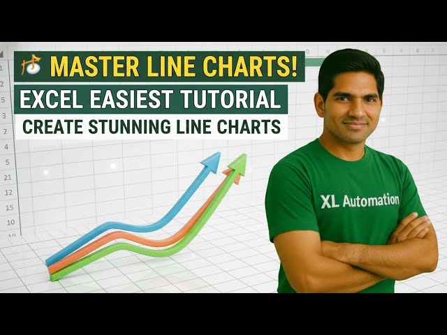
Learn how to create a line chart in Excel step by step. This tutorial shows you how to plot data, customize chart elements, and ...

3:12
How to Create a Line Chart in Excel | How to Create Line Charts in Excel for Data Analysis

42 views

2 weeks ago

Maven Analytics
9 Essential Chart Types for Data Analysts | Data Visualization 101

There are so many chart types to choose from out there, but there are nine that will cover the majority of your needs. In this video ...

7:14
9 Essential Chart Types for Data Analysts | Data Visualization 101

5,907 views

2 weeks ago

Tech Solutions
Convert your boring chart to eye catching visual in excel

Tired of looking at dull, boring charts in Excel? In this video, you'll learn how to convert your boring Excel charts into eye-catching ...

3:27
Convert your boring chart to eye catching visual in excel

52 views

3 weeks ago

Data with Ridwan
Healthcare Data Analysis in Excel | Dashboard, Insights & Business Questions (Part 2)

In this video, I walk through Part 2 of a real-world Healthcare Data Analysis project using Microsoft Excel. This session focuses on ...

1:45:52
Healthcare Data Analysis in Excel | Dashboard, Insights & Business Questions (Part 2)

314 views

2 weeks ago

AllinOne
3. Visualizing with Charts - Data Visualization with Excel
6:04
3. Visualizing with Charts - Data Visualization with Excel

1 view

4 weeks ago

Daniel Githua Tutor
Excel Bar Charts Explained: Visualize Data Like a Pro

Learn how to create powerful bar charts in Excel that make your data pop! In this tutorial, I'll walk you through the step-by-step ...

4:11
Excel Bar Charts Explained: Visualize Data Like a Pro

3 views

5 days ago

Euron
Connect Data to Charts: Excel, CSV & Google Sheets #DataVisualization #ExcelTips

Euron - https://euron.one/ Live Class Link: https://euron.one/course/business-analyst-mastery-bootcamp ...

19:56
Connect Data to Charts: Excel, CSV & Google Sheets #DataVisualization #ExcelTips

32 views

3 weeks ago

Genius Tech Shcool
Statewise Sales Data Visualization on India Map Using Excel | Excel Map Chart Tutorial

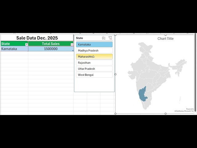
Learn how to display statewise sales data on an India map using Microsoft Excel in this step-by-step tutorial. This video explains ...

1:29
Statewise Sales Data Visualization on India Map Using Excel | Excel Map Chart Tutorial

32 views

2 weeks ago

Microsoft Office Lessons: Excel Word PowerPoint
Create Excel Charts with Two Y-Axes for More Detailed and Comparative Data Visualization

Create Excel Charts with Two Y-Axes for More Detailed and Comparative Data Visualization.

1:09
Create Excel Charts with Two Y-Axes for More Detailed and Comparative Data Visualization

0 views

8 days ago