ViewTube

ViewTube
Sign inSign upSubscriptions
Filters

Upload date

Type

Duration

Sort by

Features

Reset

695 results

Andreas Exadaktylos
Scrollable Tables in Excel: The OFFSET Formula Hack

Download the COMPLETE FREE Template: https://bit.ly/4bA3d4C (50% OFF) Excel DASHBOARD Course ...

11:27
Scrollable Tables in Excel: The OFFSET Formula Hack

2,955 views

6 days ago

Data Driven Path
Excel Dashboard Design for Data Visualization | Complete Guide 2

Learn how to design a professional Excel dashboard that transforms raw data into clear, insightful, and visually stunning data ...

33:20
Excel Dashboard Design for Data Visualization | Complete Guide 2

17 views

2 days ago

PrimeSkill Explorer
How To Create A Line Graph With Multiple Lines In Excel

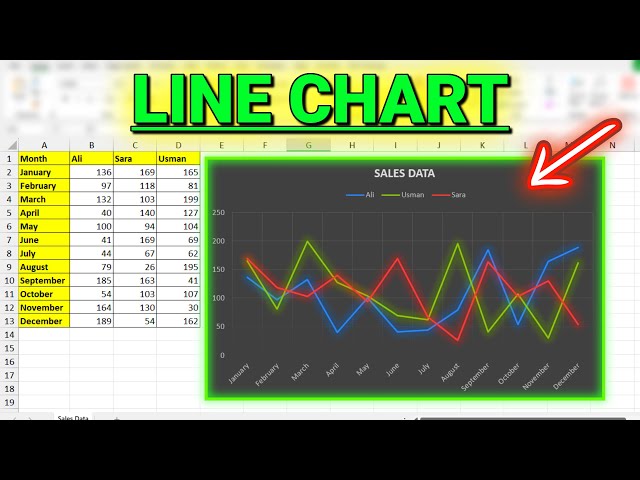
Keywords: line graph multiple lines excel, multi line chart excel, create line chart excel, excel data visualization, compare data ...

2:48
How To Create A Line Graph With Multiple Lines In Excel

0 views

1 day ago

The FP&A Guy
Excel Hour - Learn to Excel with The FP&A Guy

Master Excel and FP&A with practical tips, powerful formulas, and real-world techniques. Join The FP&A Guy for hands-on ...

1:06:16
Excel Hour - Learn to Excel with The FP&A Guy

113 views

Streamed 5 days ago

RxData Hub
EXCEL Step by Step Full Data Analysis Project

Okay which is good So let's do Ctrl X Go to our data visualization Ctrl V. So the first thing you want to do is control one Click on no ...

1:45:46
EXCEL Step by Step Full Data Analysis Project

322 views

6 days ago

Daniel Githua Tutor
Excel Bar Charts Explained: Visualize Data Like a Pro

Learn how to create powerful bar charts in Excel that make your data pop! In this tutorial, I'll walk you through the step-by-step ...

4:11
Excel Bar Charts Explained: Visualize Data Like a Pro

3 views

5 days ago

AnalyticsByShweta
Circle Indicator Chart in Excel 🔥 | Build Clean KPI Dashboards (Step-by-Step) | Excel Dashboards

#exceltutorial #excel #datavisualization #infographic #excelchartstutorial #excelcharts #exceldashboardstutorial ...

5:22
Circle Indicator Chart in Excel 🔥 | Build Clean KPI Dashboards (Step-by-Step) | Excel Dashboards

29 views

3 days ago

Other Level’s
Excel Forecast Dashboard Full Build - Weekly Pacing, Commit Discipline & Month-End Scenarios

https://www.other-levels.com The #1 Website Worldwide for Excel Dashboard Templates, Reports, and Professional ...

32:24
Excel Forecast Dashboard Full Build - Weekly Pacing, Commit Discipline & Month-End Scenarios

1,167 views

2 days ago

Akshrika Tutorials
Excel Geography Data Type - How to Use City and Capitals Feature in Excel Map Chart #shorts #excel

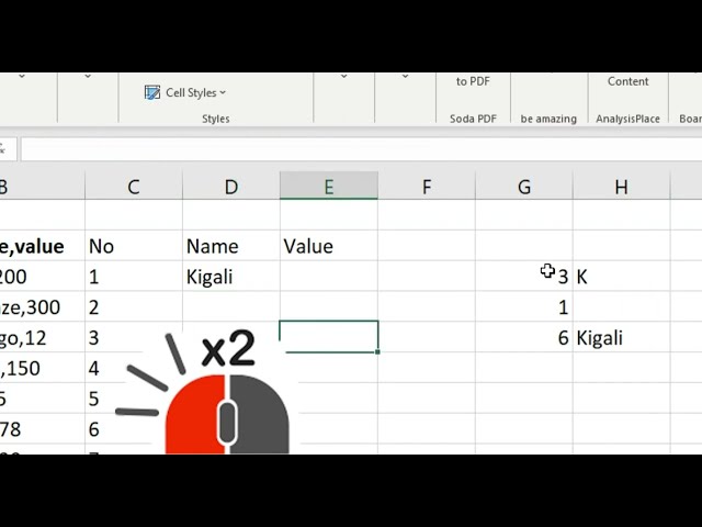
Excel City & Capitals Feature - Geography Data Type Tutorial! Learn how to use the powerful geography data type in Excel to ...

0:12
Excel Geography Data Type - How to Use City and Capitals Feature in Excel Map Chart #shorts #excel

0 views

2 days ago

Jon Schwabish
Automate Excel Graphs: AI Creates Test Data

WHAT YOU'LL DISCOVER In this video, I show how to use ChatGPT to write a simple VBA macro in Excel that automatically ...

6:57
Automate Excel Graphs: AI Creates Test Data

57 views

6 days ago

Project Management Mastery
STEP by STEP: Build the Excel Dashboard I Use for Updates on Tasks or Projects

This Excel technical walkthrough demonstrates how to construct a dynamic status report using data validation and conditional ...

38:18
STEP by STEP: Build the Excel Dashboard I Use for Updates on Tasks or Projects

97 views

6 days ago

Excel Lab PK
🔥 The Ultimate Excel Dashboard 2026: 12 Data Science Hacks to Visualize Data Like a Pro

The Ultimate Excel Dashboard 2026: 12 Data Science Hacks to Visualize Data Like a Pro Take your Excel dashboards to the next ...

28:29
🔥 The Ultimate Excel Dashboard 2026: 12 Data Science Hacks to Visualize Data Like a Pro

169 views

2 days ago

Analytics Advisors
69. Master Clustered Bar Charts in Excel in 5 Minutes 🔥

My Microsoft Excel Playlist: https://www.youtube.com/playlist?list=PLHrw3fxxgFBRyH308kfvRZnAIevkaKkf0 Want to create ...

5:09
69. Master Clustered Bar Charts in Excel in 5 Minutes 🔥

15,034 views

4 days ago

Simplilearn
Data Analytics Full Course 2026 [FREE COURSE] | Data Analytics Projects For Beginners | Simplilearn

The course starts with Excel data analysis, covering data validation, conditional formatting, data cleaning, Power Query, pivot ...

2:44:55
Data Analytics Full Course 2026 [FREE COURSE] | Data Analytics Projects For Beginners | Simplilearn

12,113 views

Streamed 6 days ago

Discover Talent™
Build a Professional Finance Dashboard in Excel (Power Query)

Stop wasting hours on manual finance reporting in Excel. In this complete step-by-step tutorial, you'll learn how to automate ...

32:37
Build a Professional Finance Dashboard in Excel (Power Query)

69 views

6 days ago

Maths Tutor Pramod Sir
Excel Data Visualization Practical |  Bar Chart, Pie Chart & Stacked Chart (Step-by-Step)

In this video, I explain Practical 1: Analyzing Buddy Group Results Using Excel Charts for FYBCOM SEM II (Data Visualization) ...

24:49
Excel Data Visualization Practical | Bar Chart, Pie Chart & Stacked Chart (Step-by-Step)

128 views

4 days ago

SlideScope
Excel Dashboard Tutorial - Sales Analysis Dashboard

excel #exceltutorial #dataanlysis #datavisualization.

50:12
Excel Dashboard Tutorial - Sales Analysis Dashboard

29 views

Streamed 6 days ago

QUASA
Flourish: Turn Any Spreadsheet into Stunning Interactive Visuals – No Code Needed

Flourish (featured on Quasa.io/projects/flourish) is a powerful, user-friendly data visualization platform that lets anyone turn ...

5:27
Flourish: Turn Any Spreadsheet into Stunning Interactive Visuals – No Code Needed

15 views

4 days ago

Fix It Excellently
Fix data that should be in multiple columns but are in one column

How to split data into columns? Fix messy data ease analysis and visualisation. Let me show you how to dispatch data into ...

9:32
Fix data that should be in multiple columns but are in one column

0 views

6 days ago

Aman Jangra1
Visualize data using chartin Excel. @Technohacksedutech @TechnoHacksLive @Mentor Sandip Garvit
0:21
Visualize data using chartin Excel. @Technohacksedutech @TechnoHacksLive @Mentor Sandip Garvit

0 views

5 days ago