Upload date
All time
Last hour
Today
This week
This month
This year
Type
All
Video
Channel
Playlist
Movie
Duration
Short (< 4 minutes)
Medium (4-20 minutes)
Long (> 20 minutes)
Sort by
Relevance
Rating
View count
Features
HD
Subtitles/CC
Creative Commons
3D
Live
4K
360°
VR180
HDR
659 results
This video shows the evolution of suicide rates per million inhabitants by country from 1900 to 2025 in a dynamic bar chart race ...
0 views
19 hours ago
In this project, I built an interactive Microsoft Excel dashboard to analyze job market trends and extract meaningful insights from ...
2 hours ago
code link https://colab.research.google.com/drive/19dSHtZNX4EAuwZ6fQbK2geTAH6LMZ1SB?usp=sharing.
1 view
4 hours ago
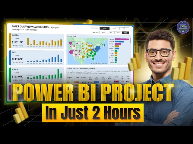
dataanalytics #powerbi #sql #python #excel #tableau Amazing Power BI Project | End to End in 2 hours | Power BI Dashboard ...
568 views
6 hours ago
It then covers advanced Excel features for data visualization, interactive dashboards, and business reporting. You will explore ...
1,876 views
Your LinkedIn data contains career intel you can't see with the naked eye. I downloaded all 50 CSV files from my LinkedIn export, ...
2,462 views
14 hours ago
This project demonstrates practical skills in business intelligence reporting, dashboard design, and data visualization using ...
1 hour ago
Download the PBIX File & Dataset FREE Power BI Beginner to Intermediate course (6+ Hours) ...
864 views
23 hours ago
In this guide, we dive deep into the most powerful AI presentation and data visualization tool of 2026, showing you exactly how to ...
95 views
16 hours ago
... ✓Excel Data Visualization ✓Excel Charts & Formatting ✓Interactive Excel Reports ⏱ Time required: Just 10 minutes Tools ...
24 views
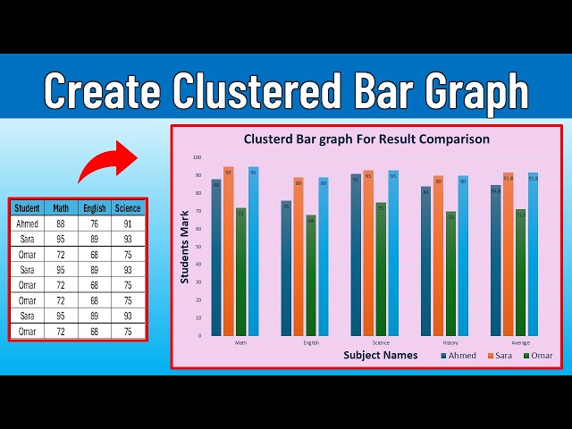
... #ExcelCharts #BarChart #ClusteredBarChart #DataVisualization #OfficeTips #Spreadsheet #DataAnalysis #ExcelForBeginners ...
45 views
1 day ago
VIDEO OVERVIEW 04_02 – BAR AND COLUMN STYLING AND FORMATTING – DATA VISUALIZATION PHILOSOPHY Building ...
20 hours ago
Deliver Live Dashboards with Microsoft Fabric Real-Time Intelligence March 1 · 8 PM IST – Set Reminder ▶️ Modern ...
46 views
Streamed 19 hours ago
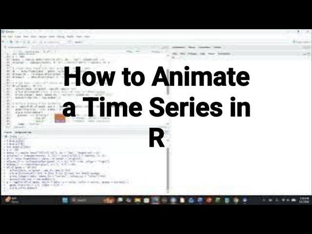
This video is a step by step demonstration for how to animate a time series using R. The R packages ggplot2, gganimate, dplyr, ...
7 views
12 hours ago
Data Visualization: Choosing the right charts to tell a compelling story. Download Practice Files Here ...
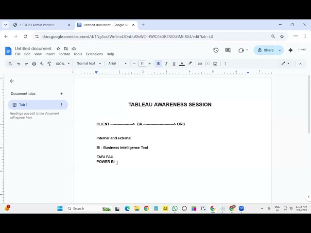
In this session, we introduce Tableau, one of the world's leading Business Intelligence and Data Visualization tools, widely used ...
9 minutes ago
... to frame your onchain findings – Turning raw data into a story that investors can't ignore ✓ Data visualization principles – How ...
0
For the Full Course Experience, sign up below. https://jellyman-education.thinkific.com/courses/getting-started-with-tableau Full ...
8 views
2 views
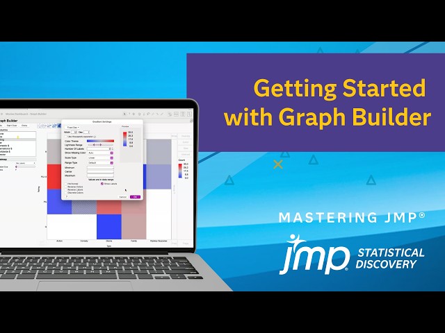
See one example of how to use JMP Graph Builder to interactively create visualizations to explore and describe your data.
20 views
Welcome to R Lesson 2 for Senior High School learners! In this lesson, we explore data frames in R and learn how to organize, ...
10 hours ago
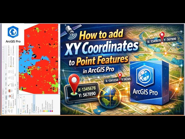
... mapping tutorial, spatial data, GIS tools, ArcGIS tutorial, map visualization, data visualization, geographic information system, ...
3 hours ago
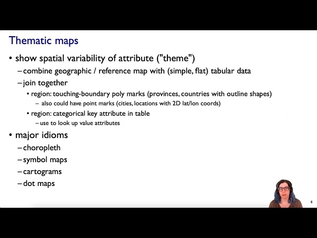
Revised version of Spatial Data (Ch 8), Visualization Analysis & Design by Tamara Munzner, CRC/Routledge 2014. More info ...
63 views
11 hours ago
AI is no longer the future — it's the present. In 2026, every company is becoming an AI company. From Machine Learning to ...
80 views
Instead of getting lost in technical details, I focus on what actually matters when you're learning data visualization and building ...