Upload date
All time
Last hour
Today
This week
This month
This year
Type
All
Video
Channel
Playlist
Movie
Duration
Short (< 4 minutes)
Medium (4-20 minutes)
Long (> 20 minutes)
Sort by
Relevance
Rating
View count
Features
HD
Subtitles/CC
Creative Commons
3D
Live
4K
360°
VR180
HDR
447,581 results
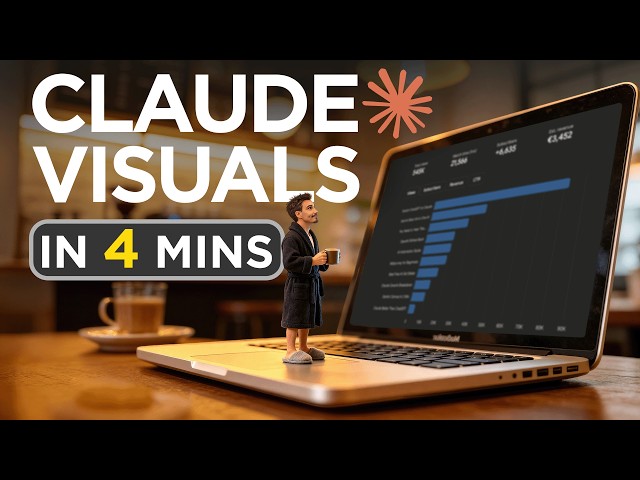
Subscribe to the channel for more breakdowns on the latest AI tools! In this video, Igor shows you how to use the new custom ...
48,958 views
3 weeks ago
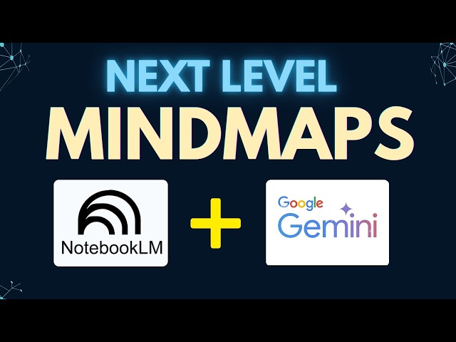
Turn your ideas into stunning visual mind maps, and take them one step further with interactive visuals. In this video, I walk you ...
38,808 views
7 days ago
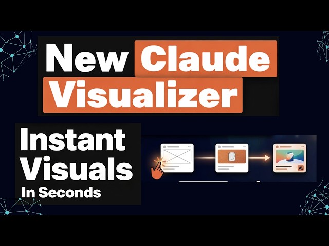
Claude just introduced a powerful new visualiser, and it completely changes how you interact with AI. You can now generate ...
29,504 views
Industrial systems generate enormous volumes of operational data, but making that data understandable and actionable requires ...
31 views
2 weeks ago
Design First, Code Second: Rethinking How We Create Data Visualizations Rome R Users Group – Guest Talk by Joseph Barbier ...
81 views
This week we're showing you how to take a large data set and use Replit to turn it into a stunning 3D visualization, inspired by ...
5,694 views
Streamed 4 weeks ago
Tableau Next is integrated with the Agentforce Analytics & Visualization agent. It's a Salesforce application accessible on the ...
35 views
9 days ago
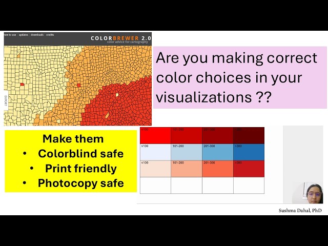
This video aims to provide an overview of ColorBrewer, an online tool that researchers can use to make good color choices in ...
55 views
4 days ago
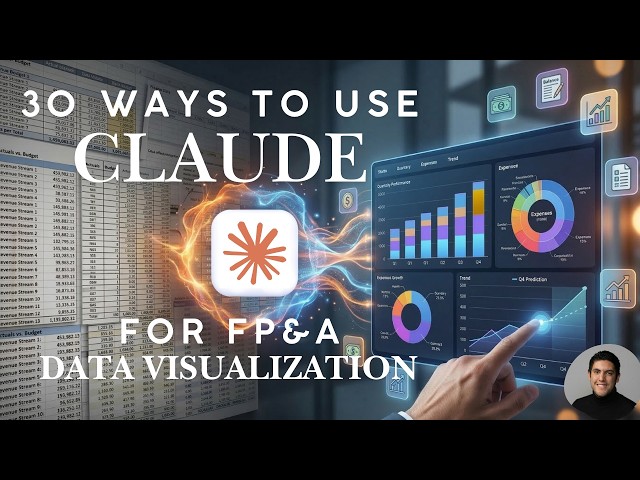
I tested 30 ways to use Claude for data visualization so you don't have to. Here's what actually works. If you work in finance or ...
7,372 views
4 weeks ago
229 views
Subscribe to my Patreon! https://www.patreon.com/MissHentaiMusic ♥ Subscribe to my Boosty! https://boosty.to/mhm Twitch ...
15,219 views
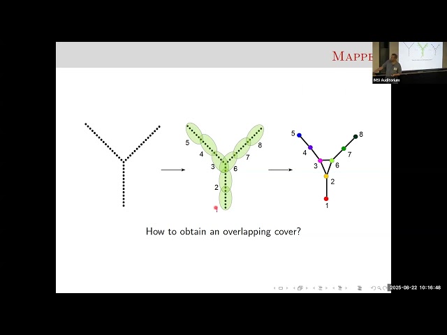
Abstract- Topology interfaces with data science primarily in two ways: by providing robust, deformation-invariant descriptors that ...
147 views
Help us grow. Subscribe: https://youtube.com/@thenonphysical?sub_confirmation=1 Background animation created by Claudio ...
58 views
10 days ago
This tutorial provides a step-by-step demonstration on how to analyze and visualize CIT (Crisis Intervention Team) data using ...
19 views
In partnership with Northeastern's Information Design and Data Visualization master's program, we're hosting a career panel ...
637 views
Streamed 9 days ago
Learn how to create professional, eye-catching data visualizations using Napkin.ai! In this step-by-step tutorial, we guide you ...
126 views
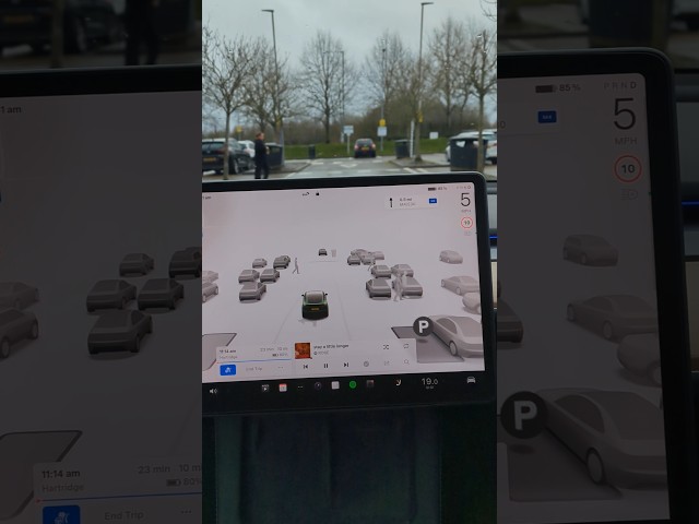
This was filmed while leaving the Tesla Superchargers at the M4 Westbound Reading Moto Services on a wet winters day.
398 views
10 hours ago
www.pydata.org PyData is an educational program of NumFOCUS, a 501(c)3 non-profit organization in the United States. PyData ...
1,188 views
NASA has released a new visualization showing what the Artemis II astronauts will see out the window as they approach the ...
2,235 views
11 days ago
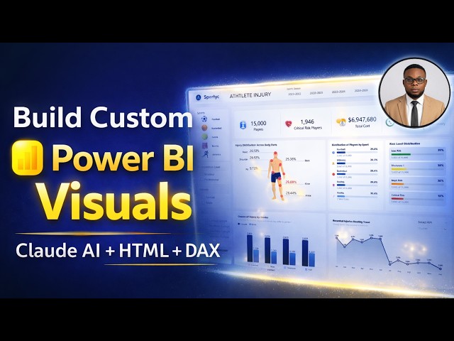
In this video, I show you exactly how to use Claude AI to generate, format, and render advanced custom HTML + DAX visuals ...
14,489 views